Paws up Society
Product: Responsive animal adoption website
Duration: 4 Weeks
Role: UX/UI Designer
Tools used: Figma, Illustrator, Photoshop, Whimsical
Note: Paws up Society is a project done through Design Lab UX Academy
BACKGROUND
Around 6.5 million companion animals enter U.S. animal shelters nationwide every year, mostly cats (3.2 million) and dogs (3.3 million). Each year, about 1.5 million shelter animals are euthanized (670,000 dogs and 860,000 cats) and around 3.2 million shelter animals are adopted.
Those are a lot of pets! Breeders don’t help on this, puppy mills contribute to animal overpopulation, and every time someone purchases a puppy or kitten from a breeder instead of adopting them, it increases the chances of animals being euthanized.
Paws up Society wants to change this.
By partnering with shelters all over the country—and eventually worldwide—they want to create a platform that allows people to see all the available animals in any shelter close (or not) to them. Awareness and discoverability are the primary things Paws up Society wants to address.
Besides investing in a responsive website to help people discover animals and learn more about shelters, Paws up Society has plans to create a website for shelters to upload animal information easily.
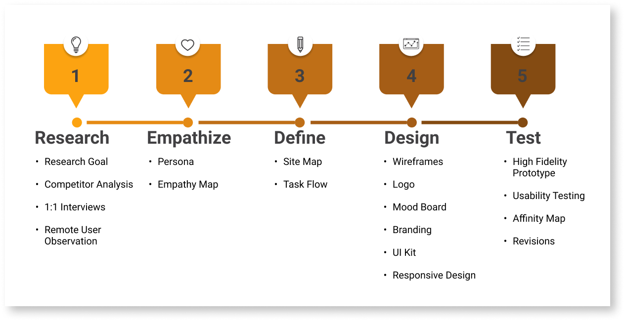
PROCESS
RESEARCH
Research Goals
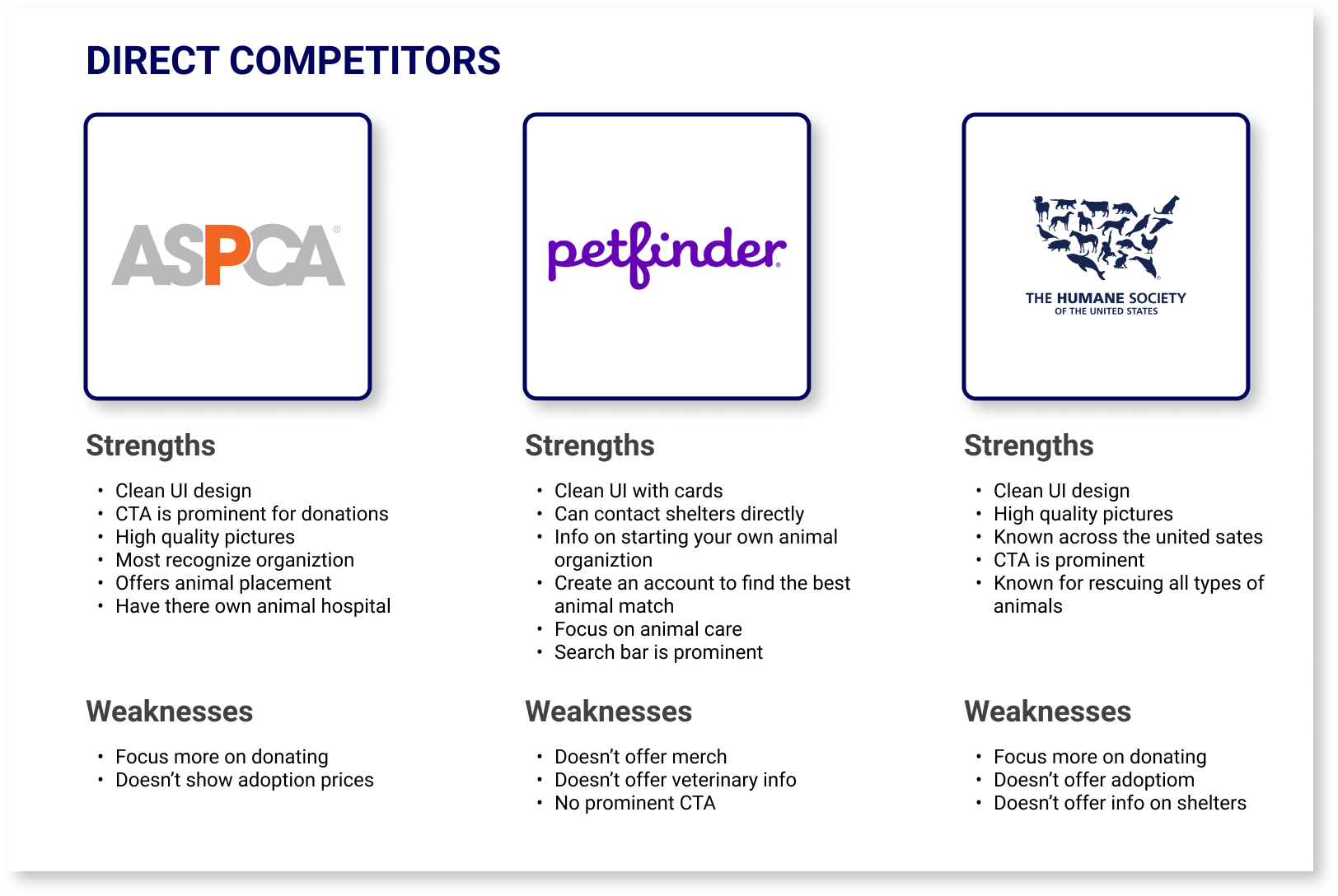
I did research on 3 direct competitors such as ASPCA, Petfinder and The Humane Society. I also did secondary research on 2 competitors which included Best Friends and Animal Care Centers of NYC. By doing research I learned how to be different from other competitors. I also created provisional personas for each competitors.
What other animal shelter websites have to offer?
What I’ve notice about animal adoption websites and what they have to offer are the following
CTA donation buttons are prominent.
Offers information about volunteer.
Has event calendars.
Search bar is prominent.
Browse pets through filters.
Information about each pet.
To further my research these are the points I targeted.
How to be different from other competitors such as ASPCA & Petfinder.
What is missing from other competitors to fill in the gap.
What is the most important information customers look for on an adoption site.
How to make it easy to navigate.
What are customers likes and dislikes about an adoption site.
1:1 Interviews
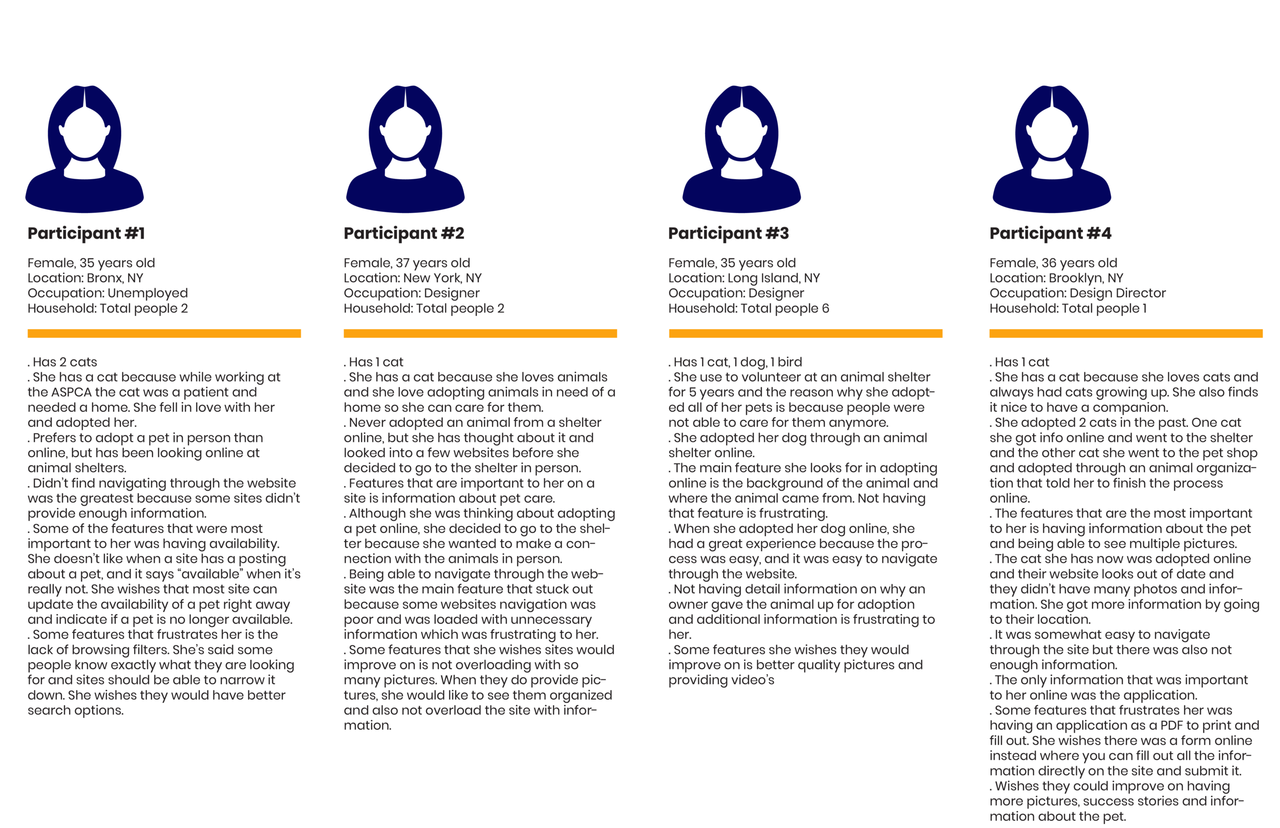
I conducted 1-on-1 interviews with 4 participants which were all females via zoom. I enjoyed doing 1-on 1 interviews for this project because it was interesting to hear the different responses the participants had and there reasoning behind it.
Research Findings
All of the participants reasoning for adopting a pet were to give a pet a better life.
The majority of the participants looked into adopting pets online, but they ended up going to the animal shelter because of the lack of information online about the background of the animal, where did they come from, if they was a surrender pet the user would like to know why and any medical conditions they might have.
The features that were important to have were browsing by filters, detail information, good navigation, high quality photos as well as enough photos, good UI that’s not out of date, provides video’s and success stories
Some of the features that frustrate them are not being able to fill out an application as a form directly online as oppose to a PDF and when a pet says “available” but it’s really not.
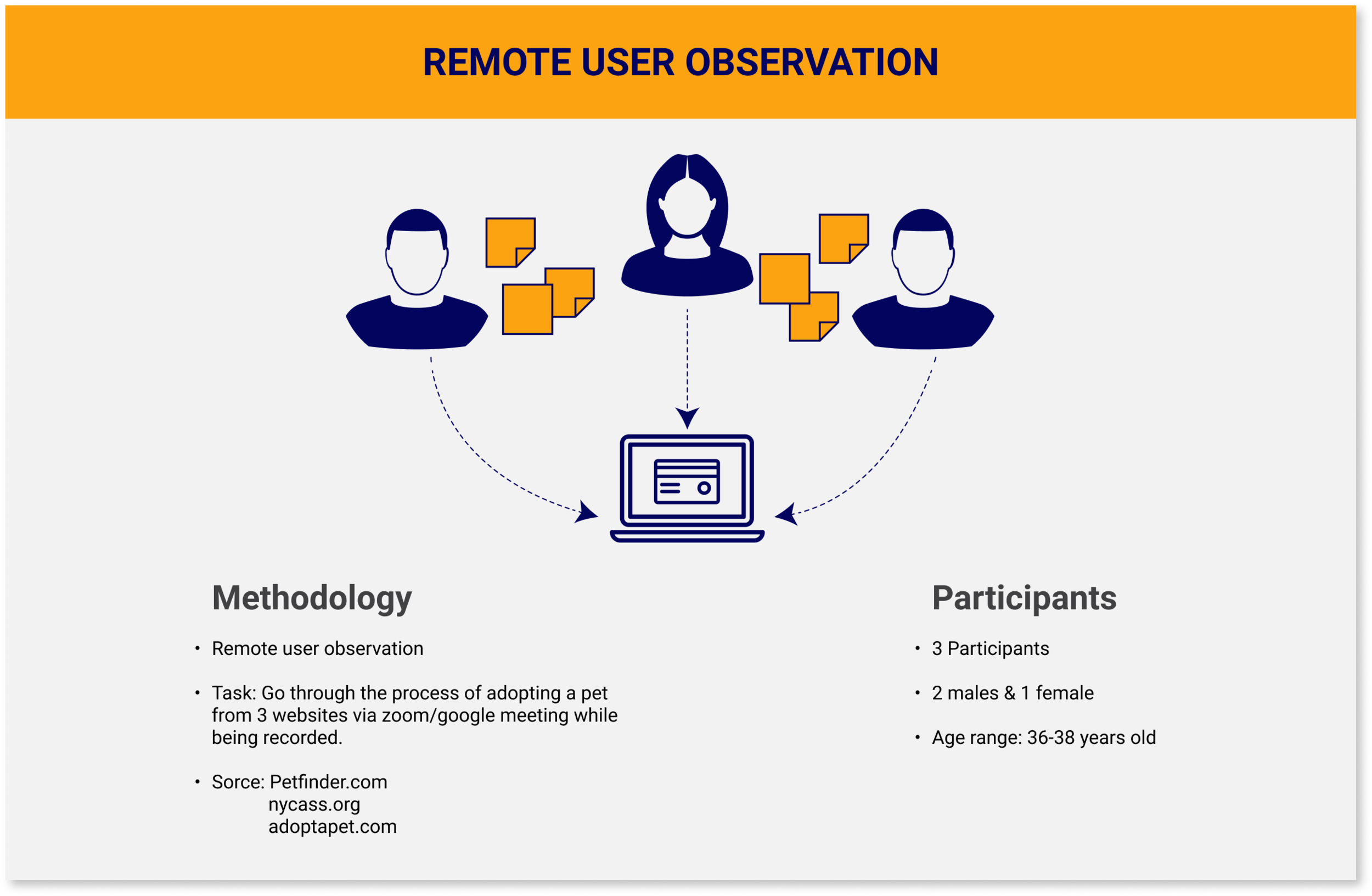
Remote User Observation
Summary Results
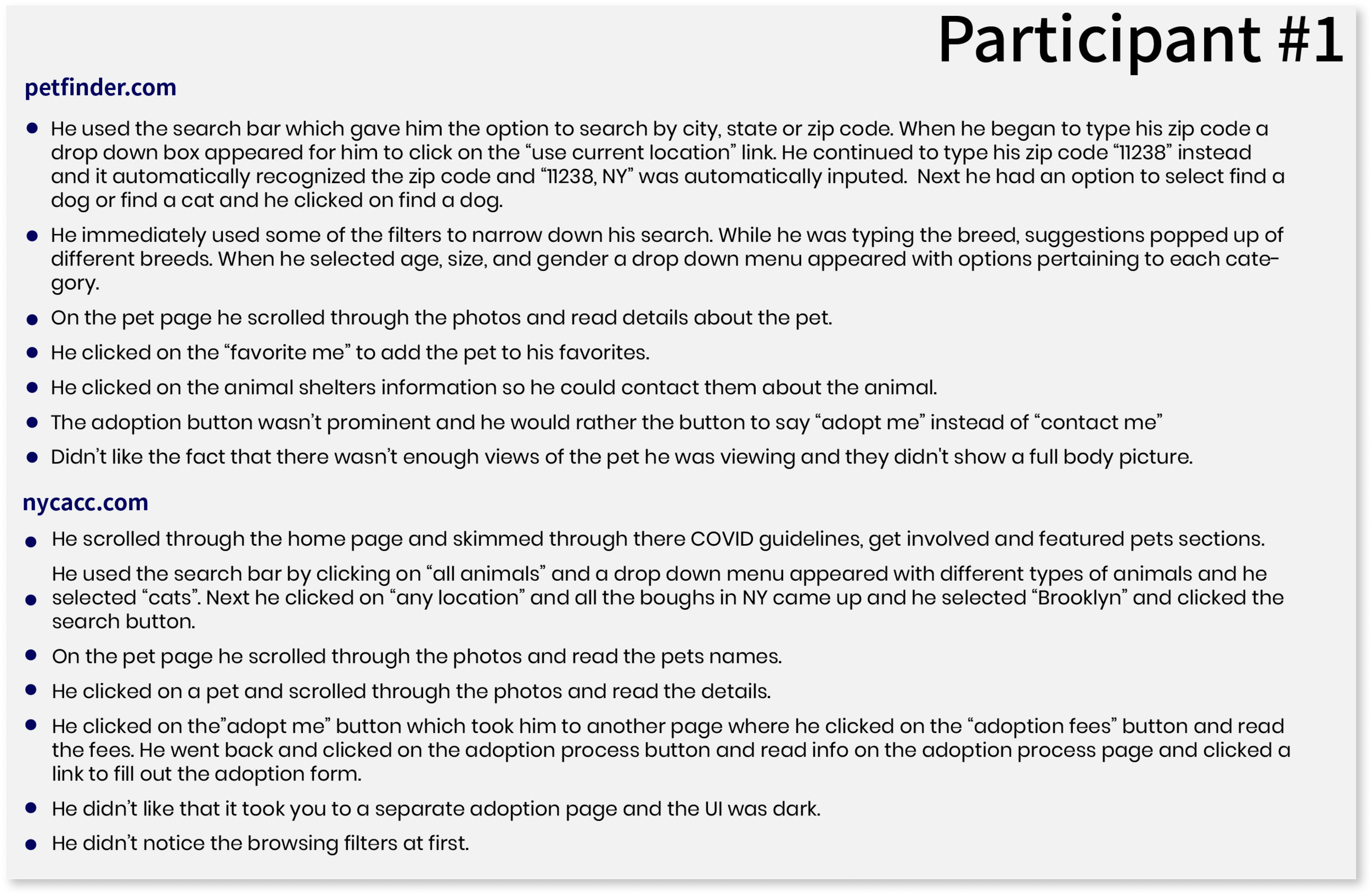
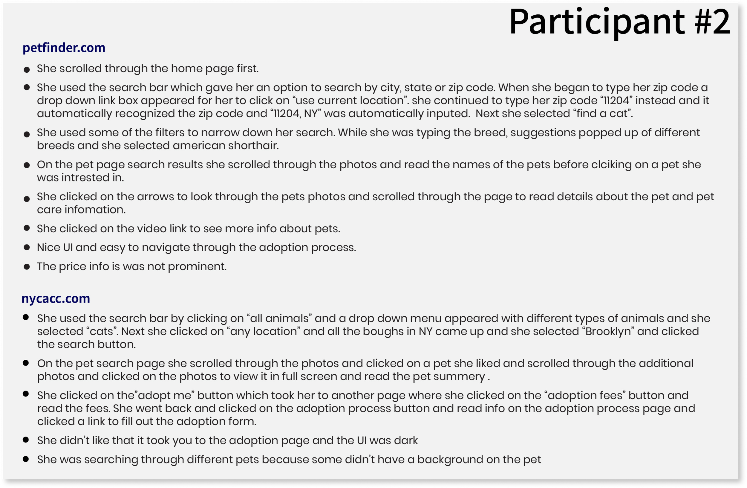
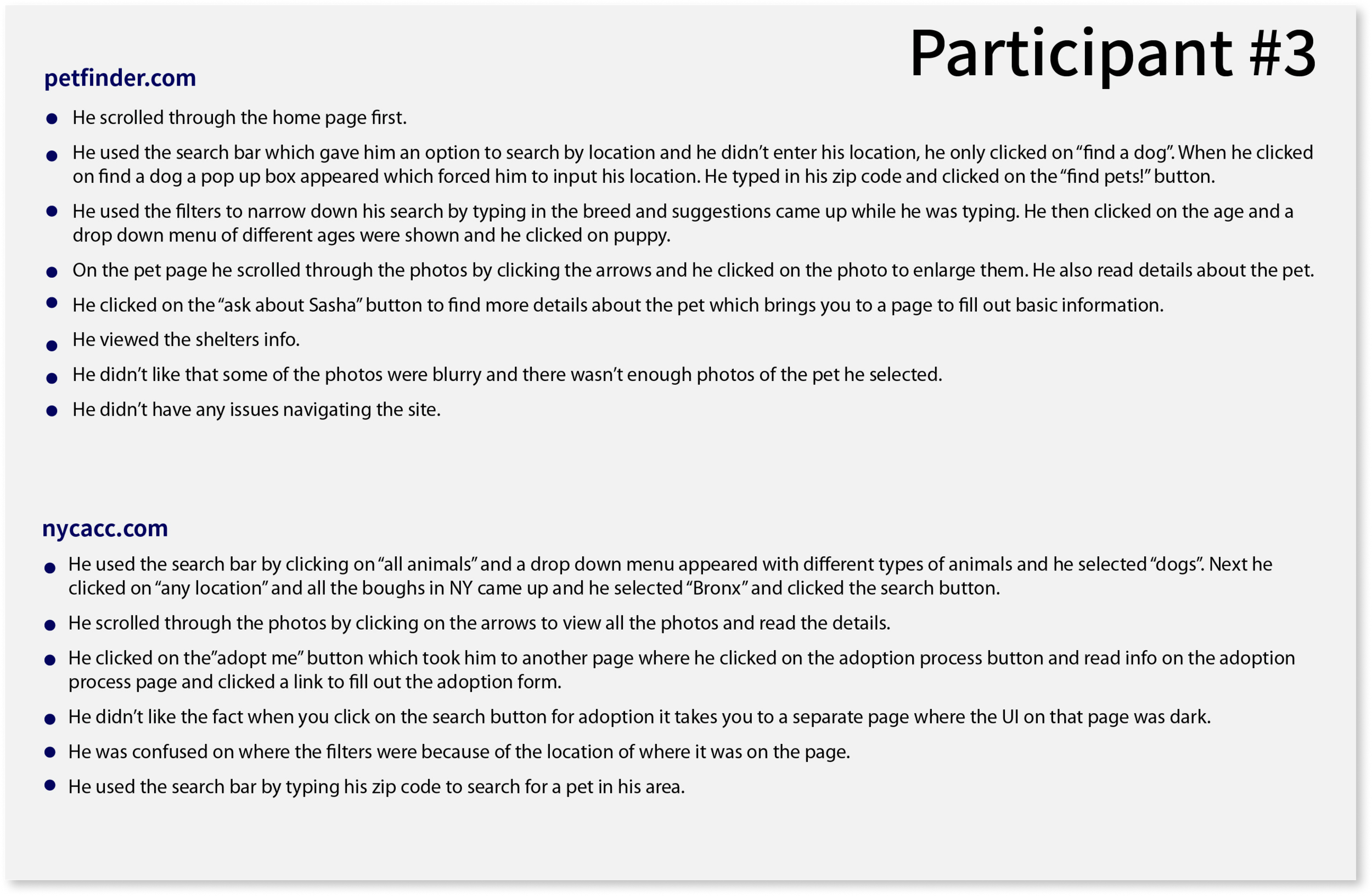
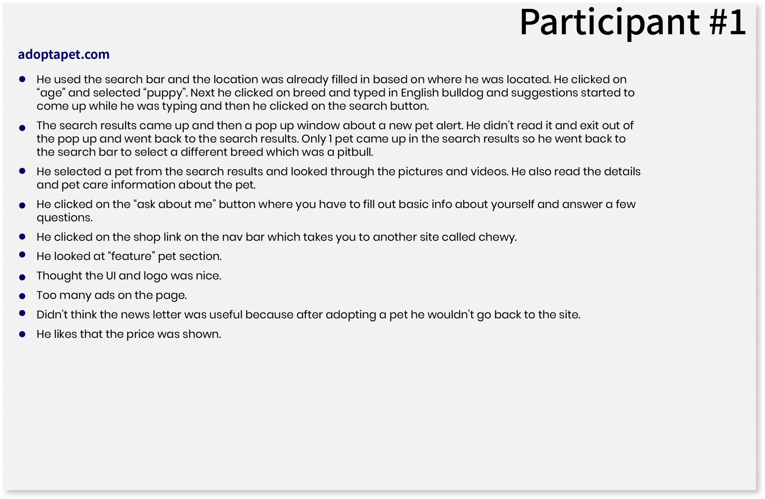
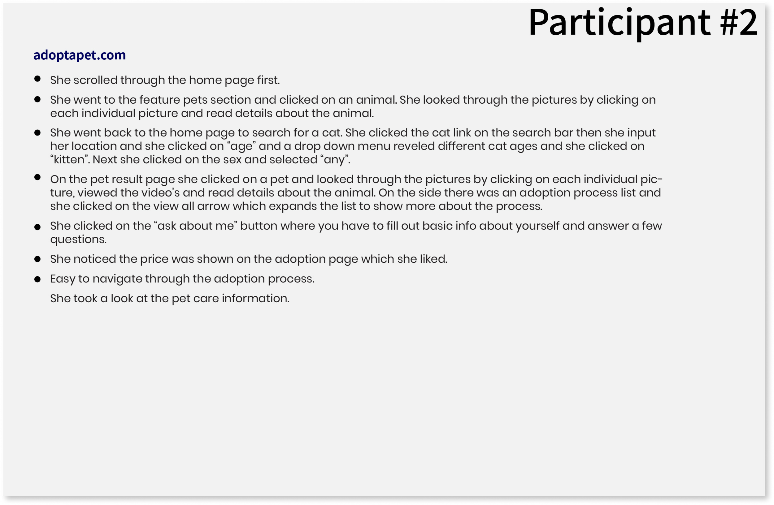
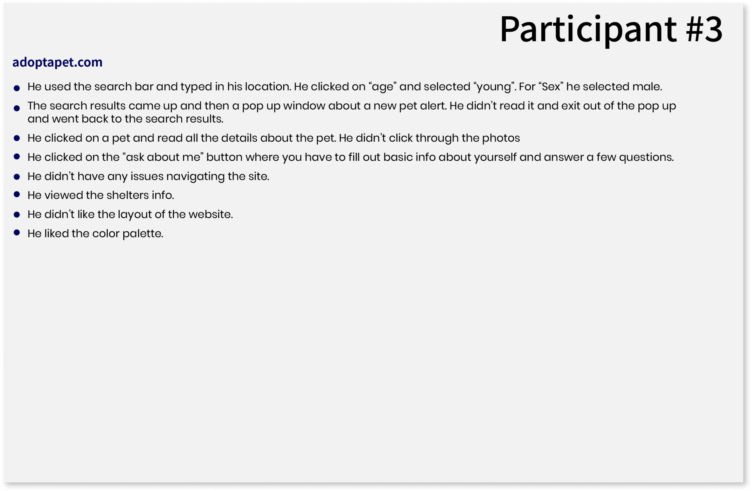
Most of the participants scrolled through the homepage for information to see what the site was about.
All the participants used the search bar to search for a pet by zip code, breed, sex or age.
Most of the participants used the filters to narrow down there search.
All the participants viewed the pets background, videos (if any) and pictures of the pets. They found the video’s to be very helpful.
Some participants viewed the shelters information.
Some participants like when the price is shown on the adoption page.
EMPATHIZE
Persona
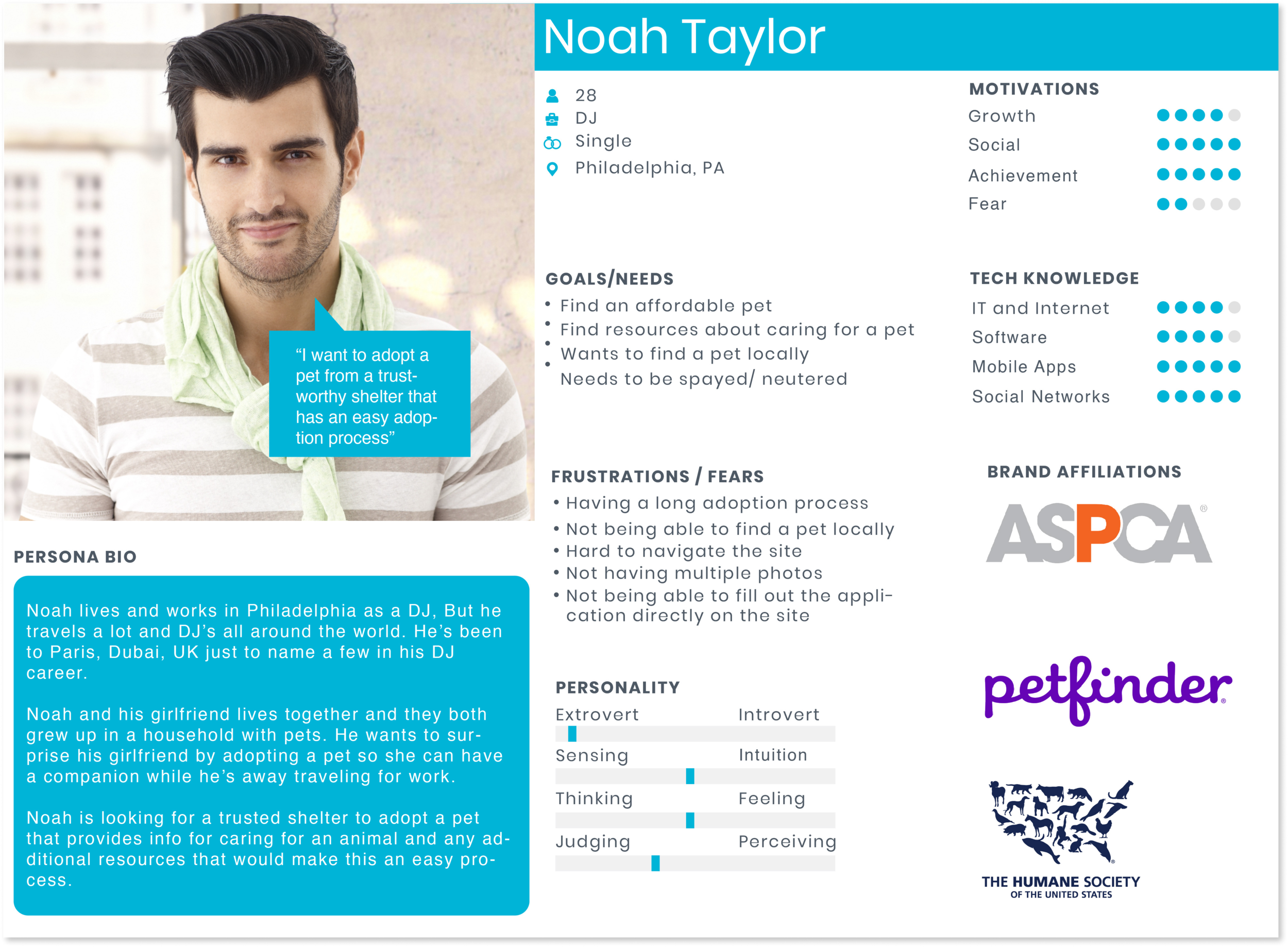
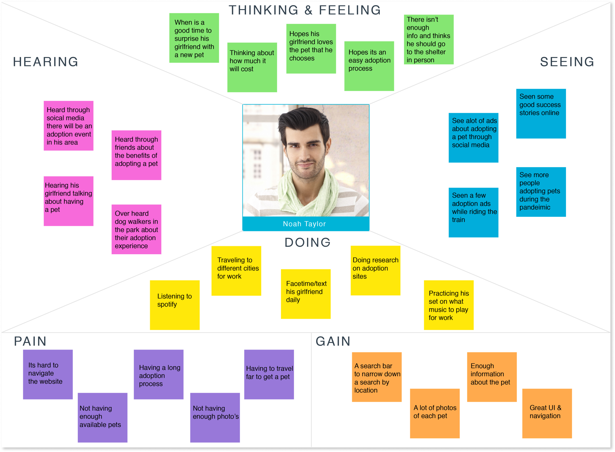
Based on my research I made a persona of a person named Noah Taylor. The persona allowed me to empathize with the user based on his goals, needs and frustrations while making design decisions.
Empathy Map
Next, I created an empathy map to get a better understanding on my persona's thinking, feelings, seeing, hearing and doing. I also got a better understanding of what his pains and gains are, so I can apply it to my decision making when it comes to design.
DEFINE
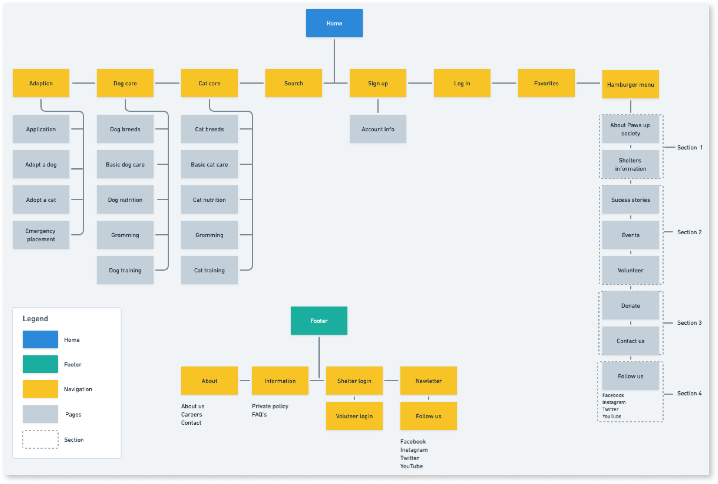
Site Map
Next, I created a site map using Whimsical for Paws up Society’s overall structure of the website based on research from other competitors and information I gained from my remote user observation. The remote user observation was helpful because I could see how other users navigate through other websites and get a sense of what was frustrating them and get additional feedback at the end of the remote user observation. I made sure to keep the overall site simple and easy to navigate by including adoption, dog care, cat care, search, sign up, log in, favorites and a hamburger menu as the main navigation.
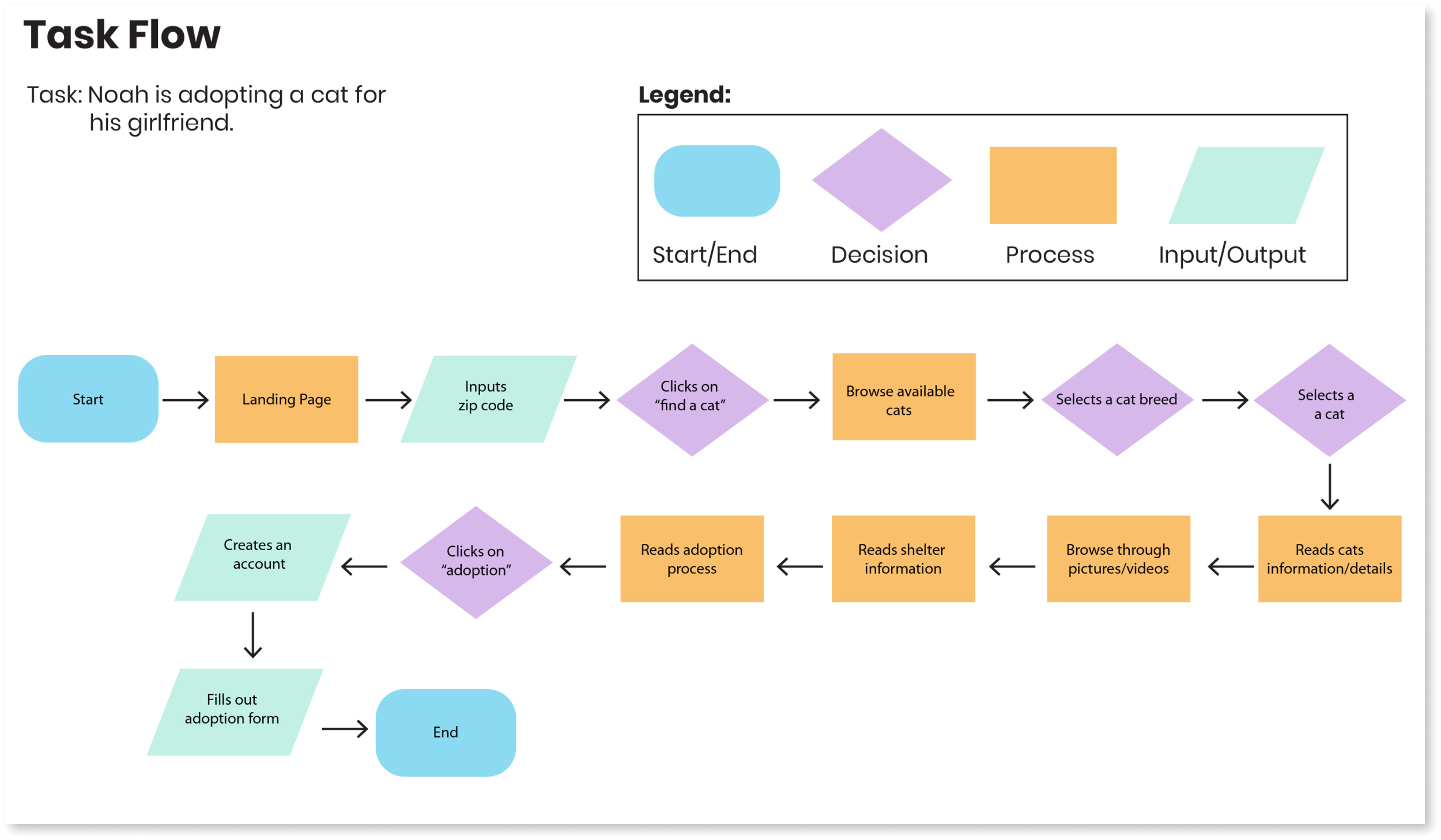
Task Flow
Next, I created a task flow for a user to go on a journey through the website by adopting a cat. The user will first start on the lading page and input a zip code to search for a cat within that location and browse for available cats in the area by using the filters to select a cat breed. Next the users selects a cat, reads info about the cat, browse through pictures/videos, reads shelter info and reads the adoption process. Next the users clicks on adoption, creates an account and fills out the adoption application.
DESIGN
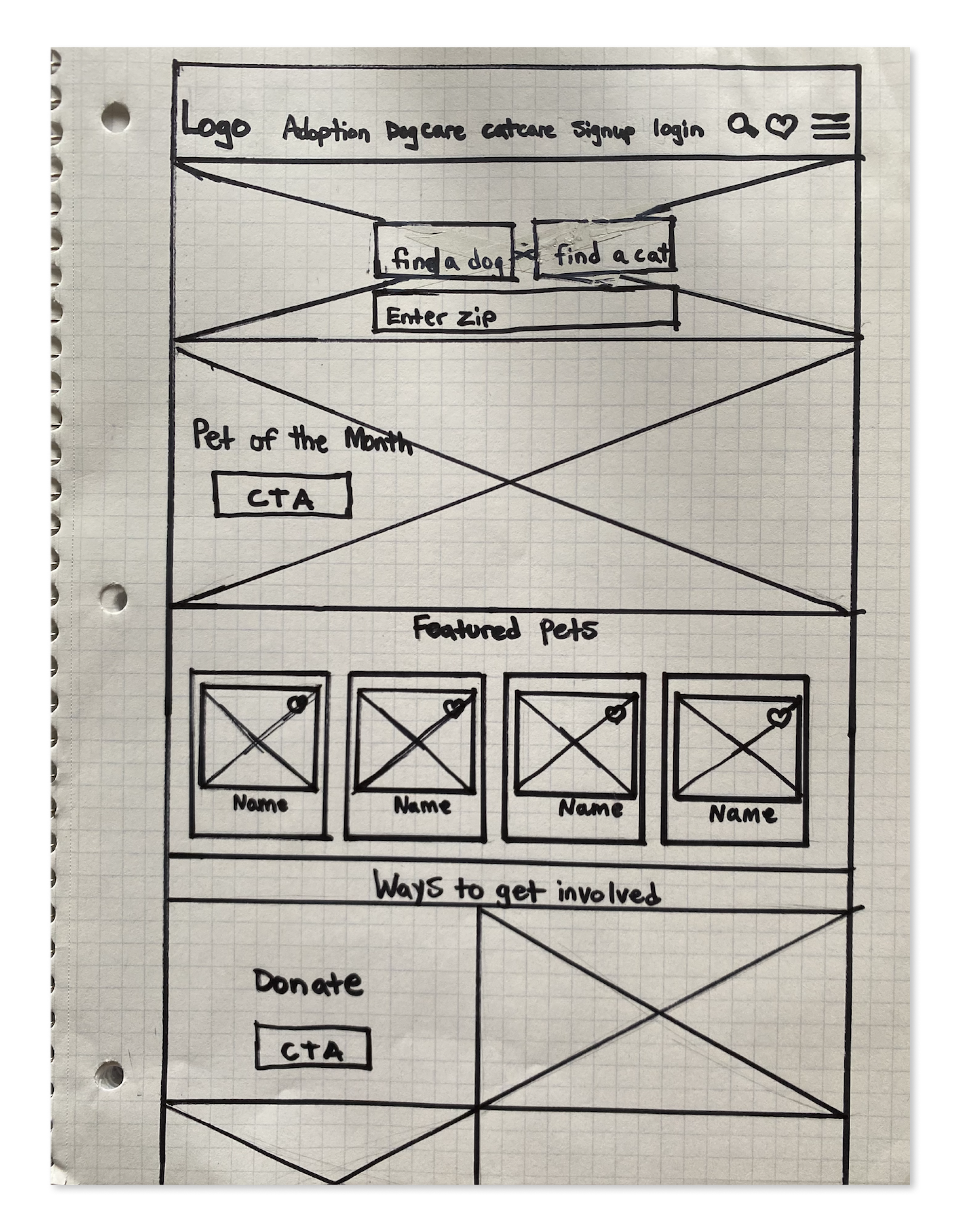
Low Fidelity Wireframes
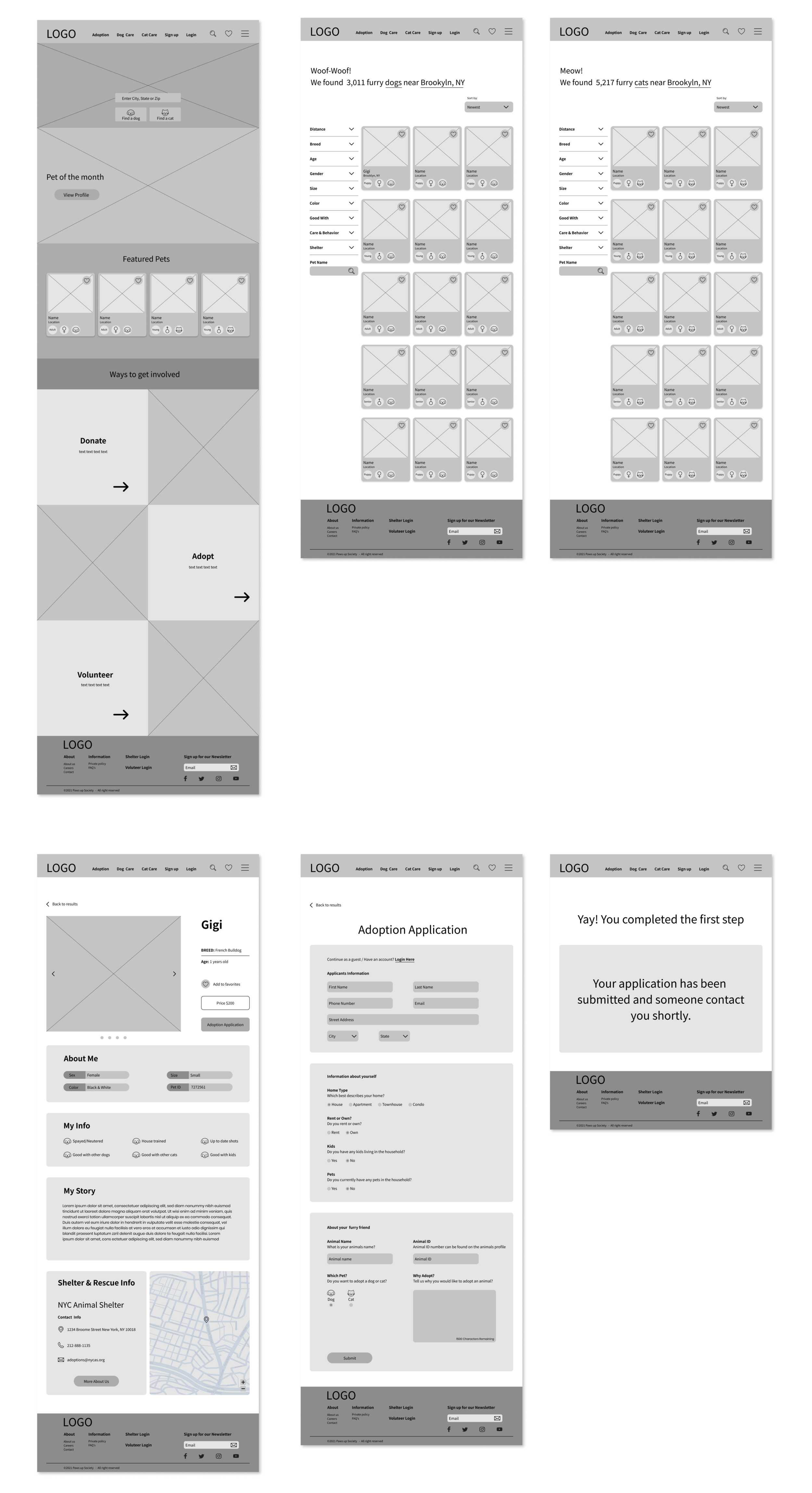
I created a version of Paws up Society landing page in a low fidelity wireframe sketch, which included the navigation where you can find the search bar, favorites, hamburger menu and along with the main categories. I also included a main search bar where you can find a dog or cat by entering your zip code. It also features a pet of the month CTA, feature pets in a card UI design, and a section where you can find more information on ways to get involved.
Mid Fidelity Wireframes
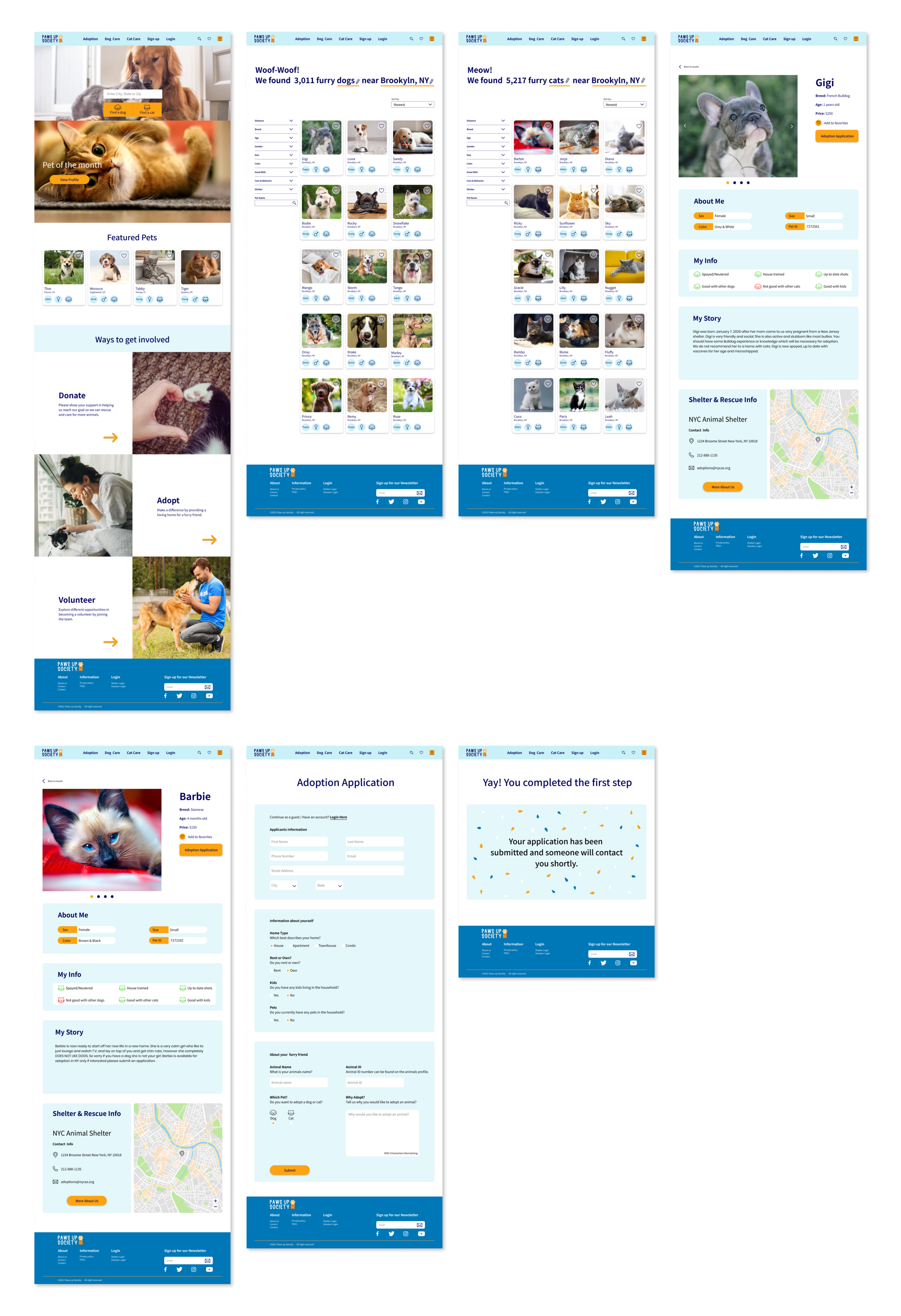
I ended up taking these elements from my sketch and created mid fidelity wireframes plus added more elements which was created in Figma. For the mid fidelity wireframes I created the homepage, dog search result page, cat search result page, animal profile page, adoption application page and submitted page.
Logo Design
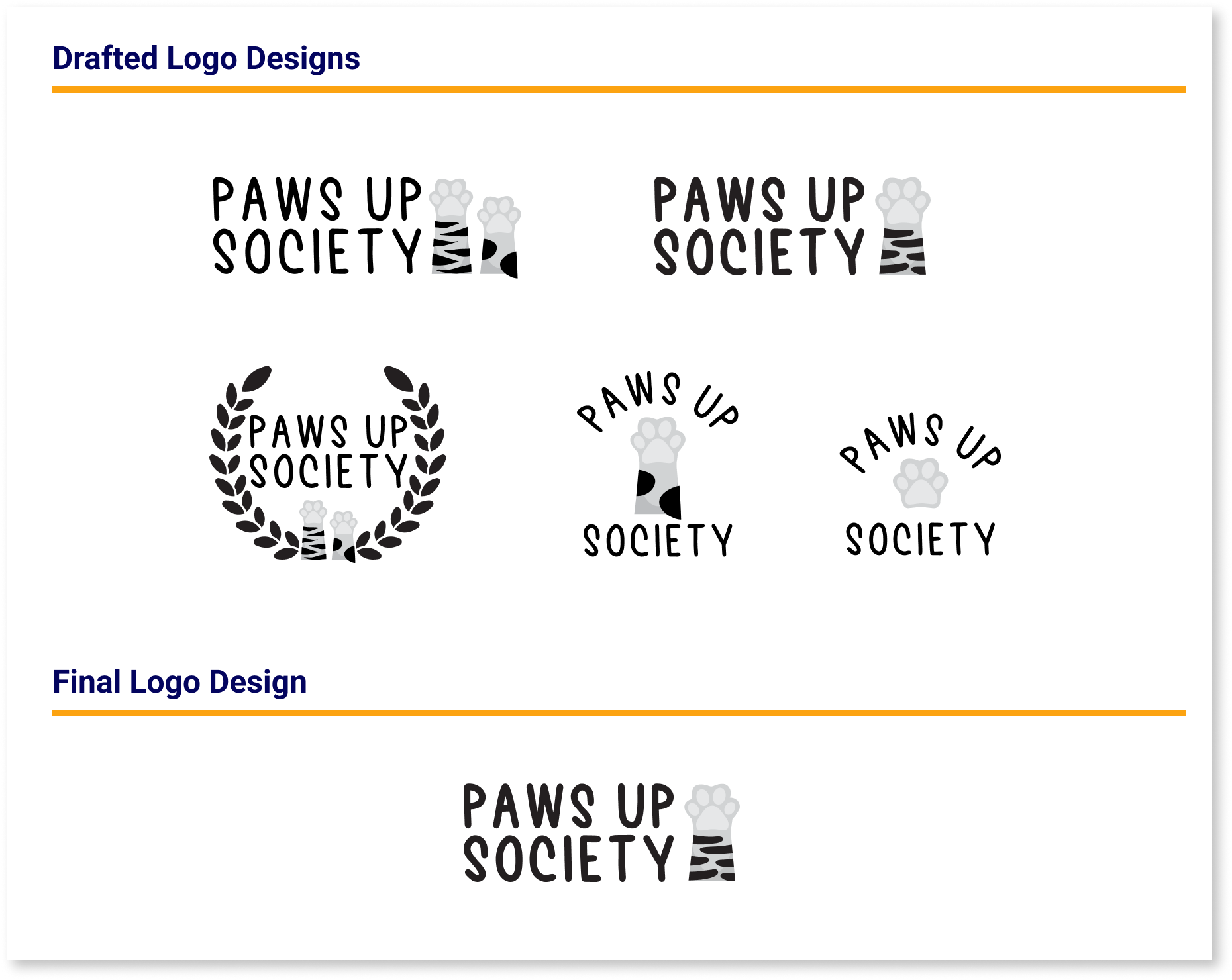
After working on wireframes I sketched a few drafts of some logo design options using illustrator. Even though I liked most of the designs I sketched. My favorite one was my final design because it’s clean and I could play around with the orange colors on the pets paw.
Branding
Mood Board
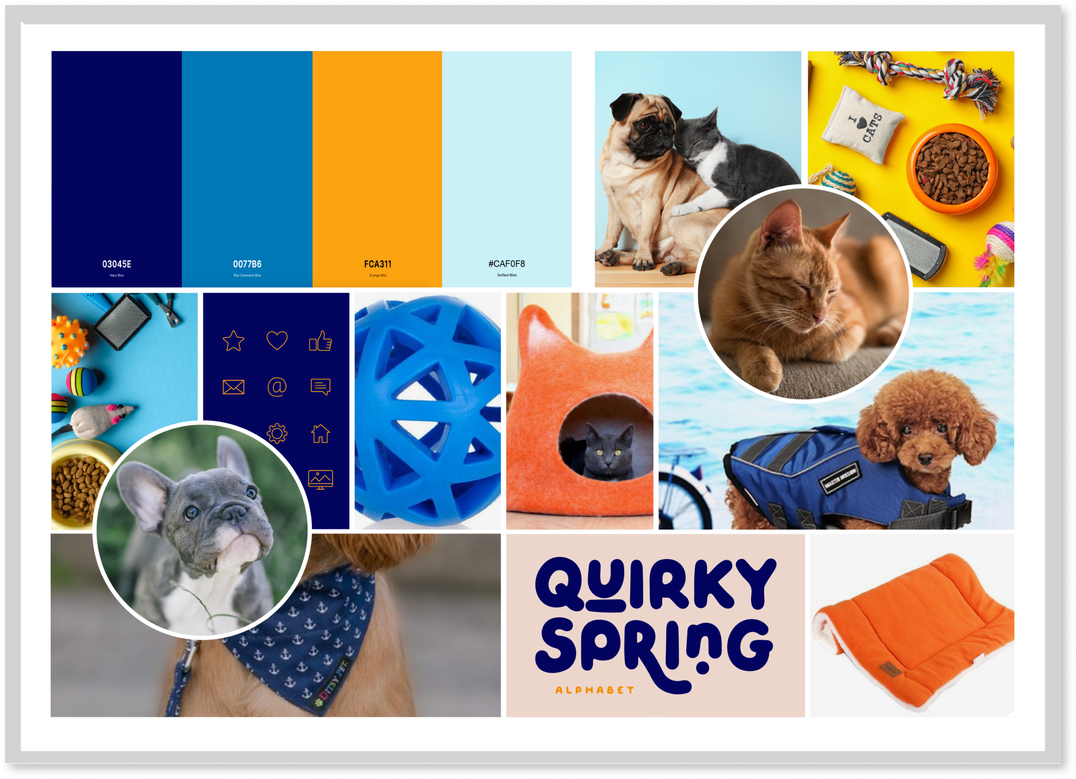
I created a mood board that has a fun and playful feeling which includes a palette of different shades of blues and a pop of orange. I pulled inspiration from Pintrest and other pet websites.
Branding Style Tile
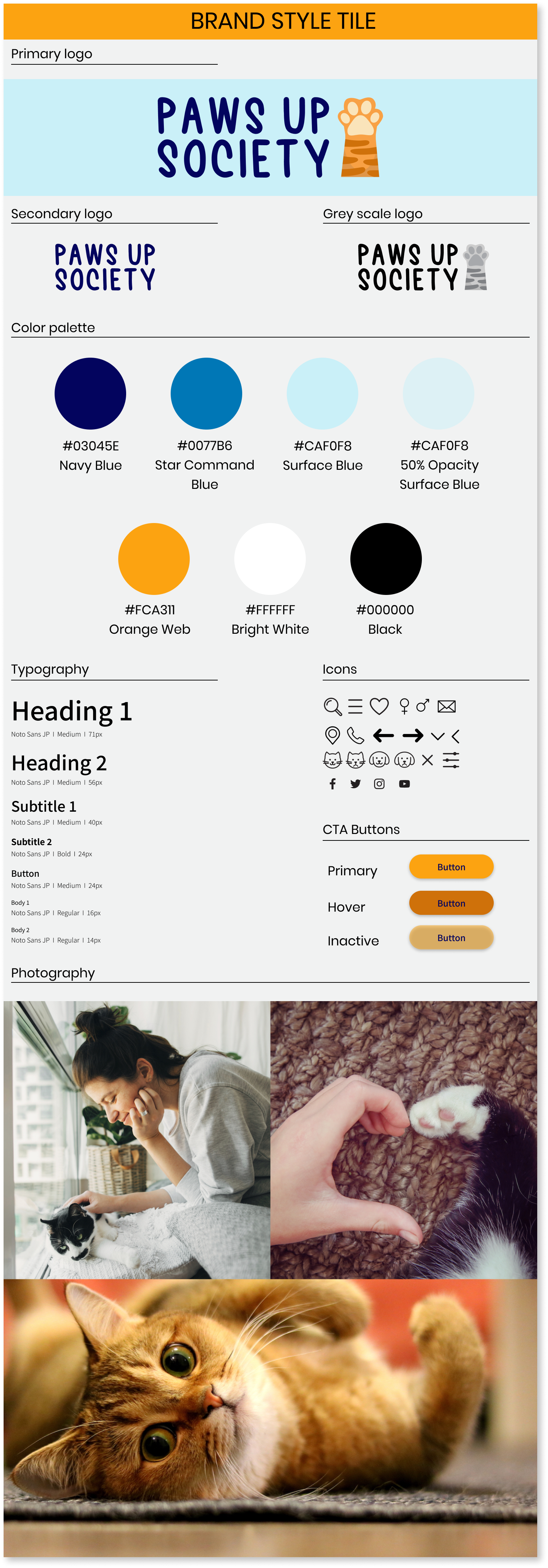
I created a branding style tile which includes the logo, typography, color palette, photography and icon set.
UI Kit
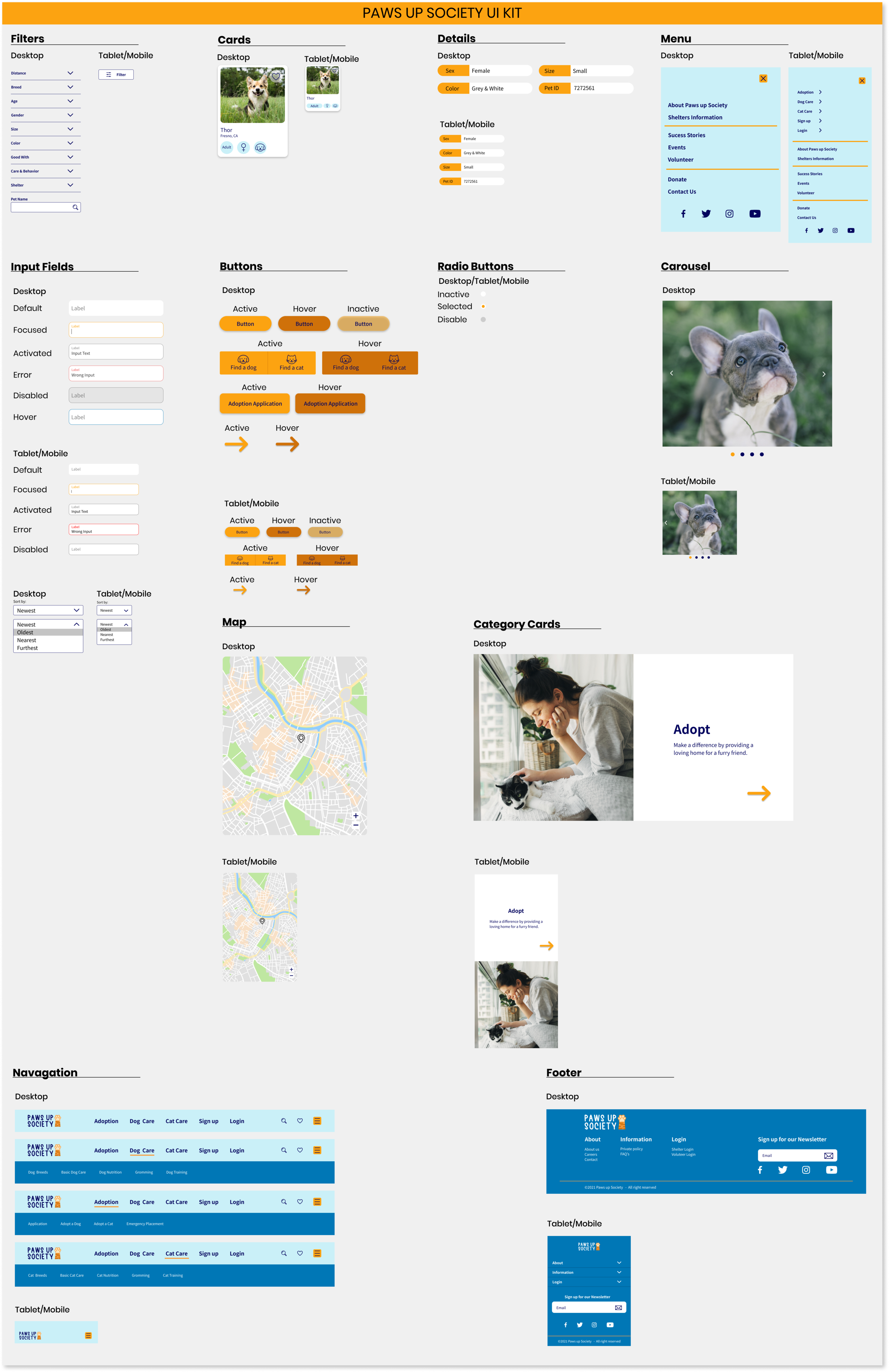
Before moving into high fidelity I created a UI kit which I got inspiration from other brands by doing some research. I included elements such as filters, cards, details, menus, input fields, buttons, carousel, map, navigation and footer. I enjoy this process because you can really see all the elements come together and it’s very useful for designing a prototype.
Responsive UI Design
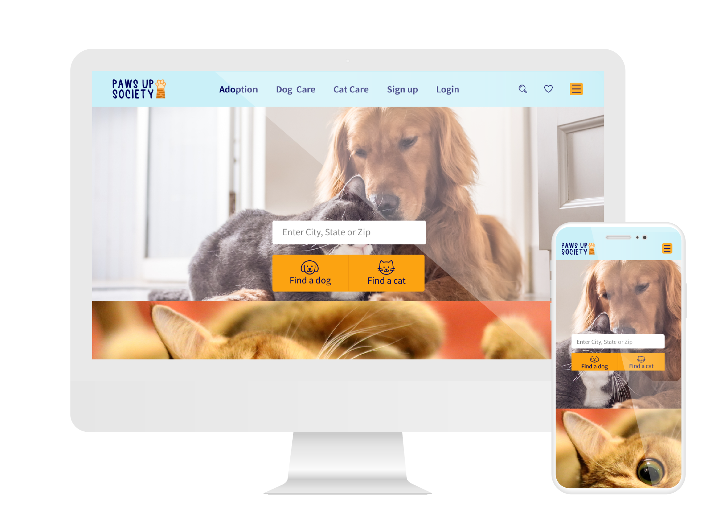
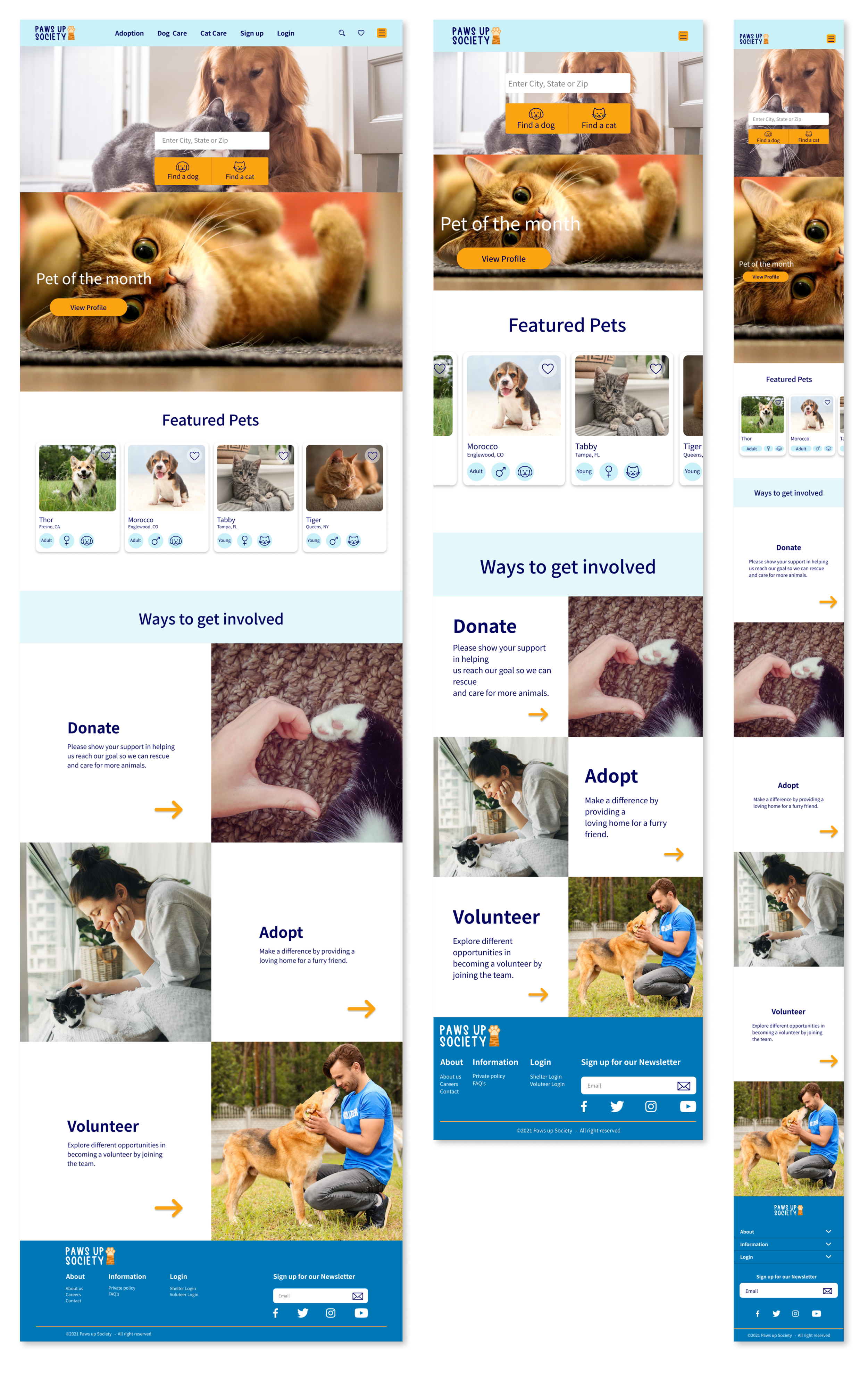
I created a high fidelity responsive design of the landing pages for desktop, tablet and mobile. I used hero photo’s, prominent search bar, featured pets using cards, donate link, adopt link, volunteer link and the footer. As a product designer I made sure the elements was consistent from desktop, tablet and mobile and also remained usable with a clean design for users.
TEST
High Fidelity Prototype
Now it was time to put it all together! I created a high fidelity prototype where a user was able to adopt a dog or cat using Figma.
Usability Test
I did a usability test on Paws up Society site where 4 people participated remote via google meeting, which included 2 males and 2 females. I took notes on each participates where they had 2 tasks to complete which involved adopting a dog and completing an adoption application. After the remote interviews I asked each participate additional feedback about the site.
Testing Goals
Test the overall navigation throughout the site.
Test the overall design flow.
Determine how long a user spends time on each task.
Identify any issues a user may have or any difficulties.
Summary & Feedback
Participate #4 thought it would be nice to have a price list by different animals or breeds.
Participate #2, 3 & 4 wouldn’t create an account because after adopting an animal they wouldn’t go back on the site often, so they prefer to continue as a guest.
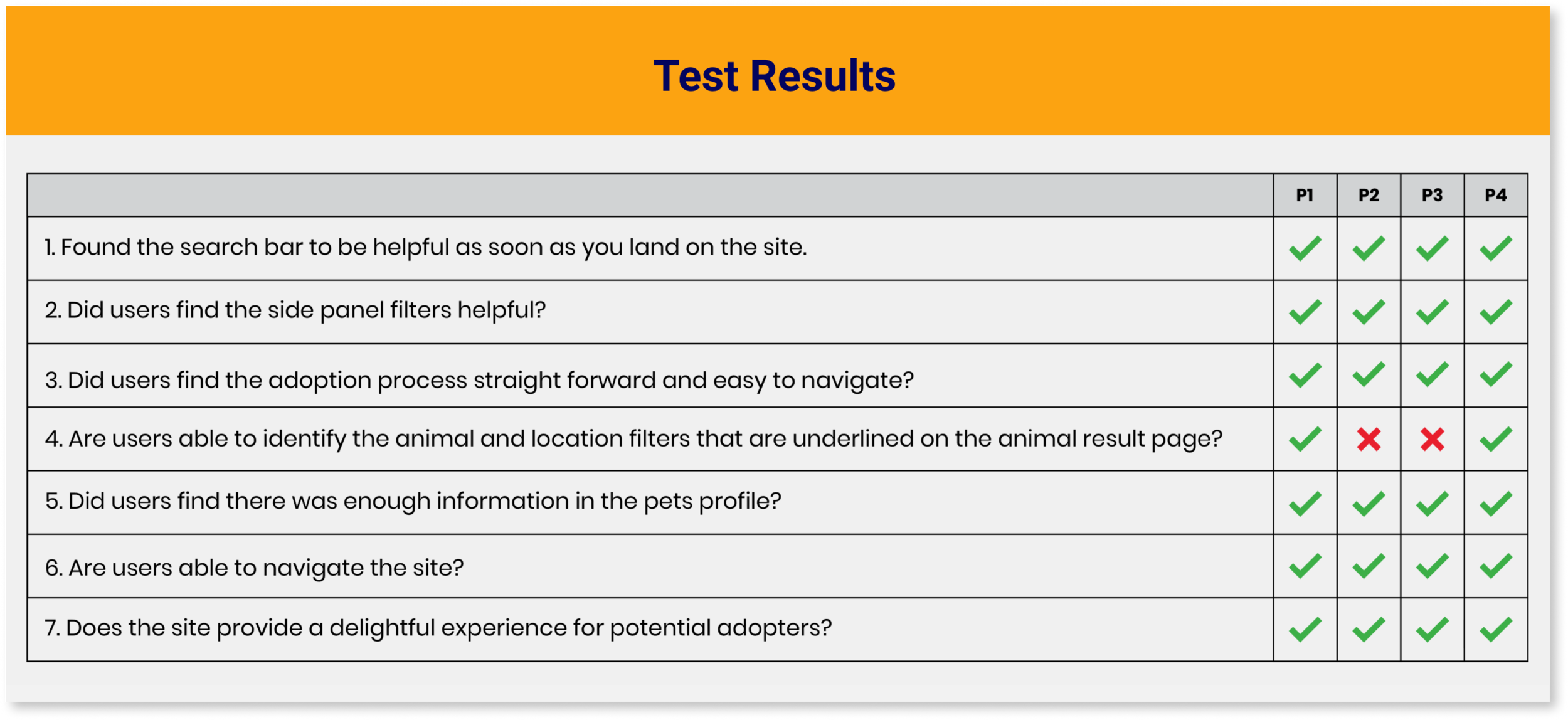
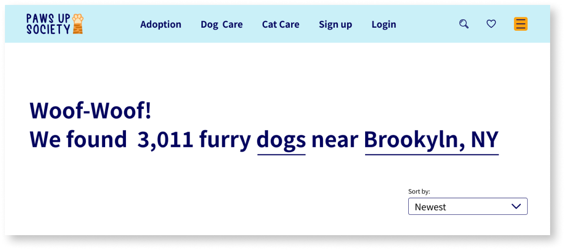
Participate #2 & 3 was confused about the animal and location filters that are underlined on the animal result page. They thought it was underlined to emphasize on the word “dog” and “Brooklyn, NY”
Participate #3 would like to see video’s of the animals to get a sense on how they behave.
Desktop High Fidelity UI Design
Affinity Map
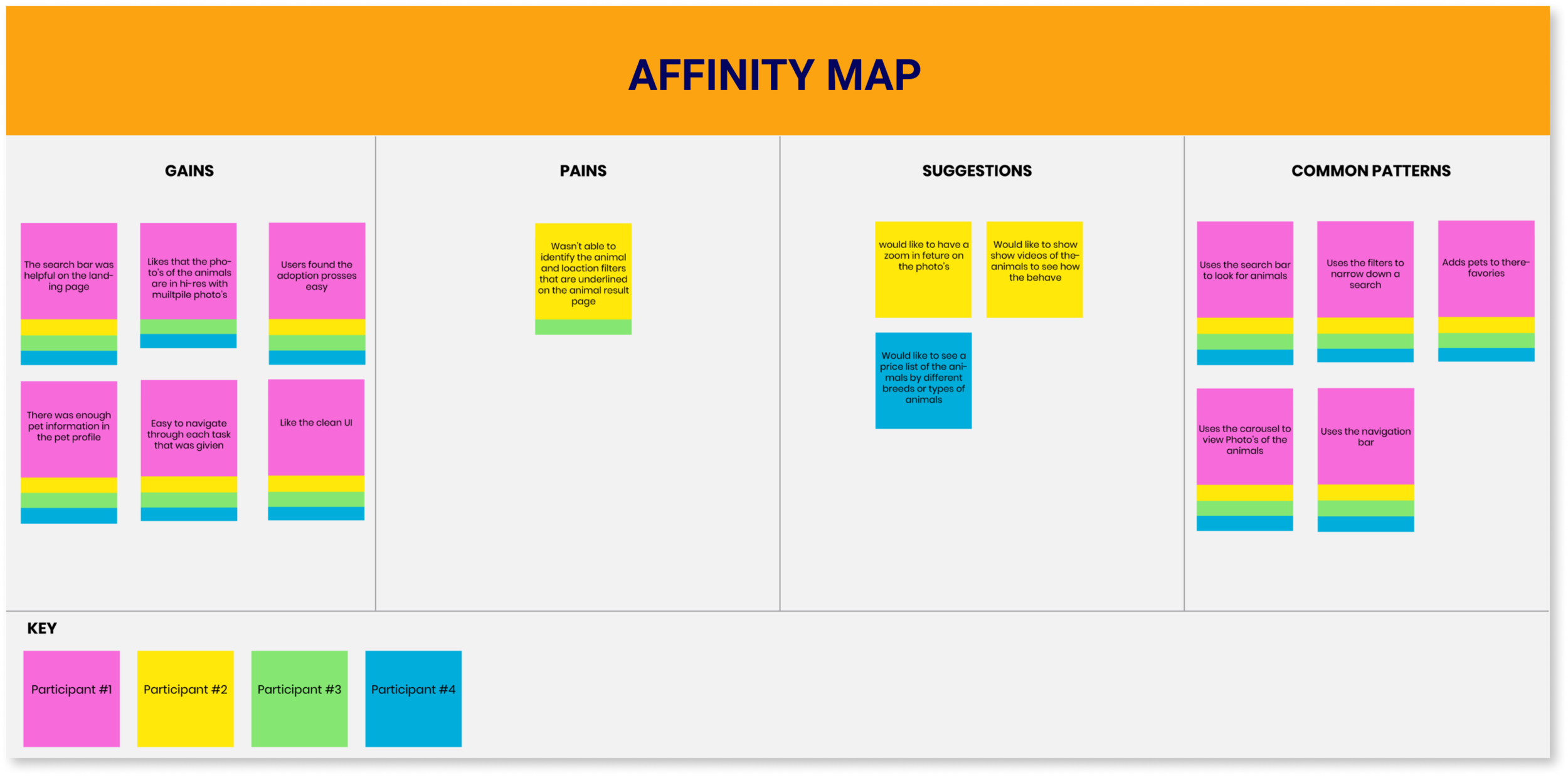
I created an affinity map based on the 4 participants from my usability test.
Gains & Common Patterns
The participates thought the UI was clean and easy to navigate.
The search bar was helpful on the landing page.
The adoption process was easy.
There was enough information about the animal in there profile.
Pains & Suggestions
Was confused about the animal and location filters that are underlined on the animal result page.
Would like to have a zoom in feture on the photo’s.
Would like to see video’s of the animals to see how the behave
Would like to see a price list on one page of the cost of each animal by breed.
REVISIONS
Before
Some users were confused about the animal and location filters that are underlined on the animal result page. They thought it was underlined to emphasize on the word “dog” and “Brooklyn, NY”…
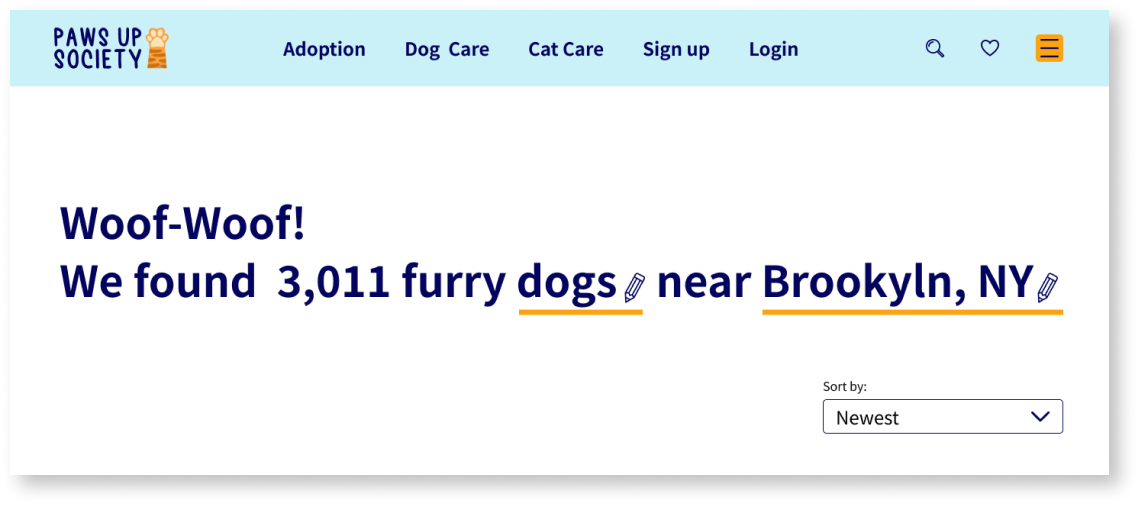
After
So, I revised the filters by making the stroke thicker and changing the color to orange so it would stand out. I also added a pencil icon so the user would know this section can be edited.
CONCLUSION
This was a fun project because I personal have a cat and I’ve had cats all my life! During the pandemic there has been a spike in adopting or rescuing an animal. Most of the participants who helped out with this project had a pet or adopted a pet for companionship. Some of the challenges I faced with this project was perfecting my UI Kit in making sure all the text fields interact a certain way, but with resources and determination I was able to get it done. I also had to do some revisions on my prototype after conducting my usability test because some users was confused about the animal and location filters that are underlined on the animal result page. They thought it was underlined to emphasize on the word “dog” and “Brooklyn, NY” so I made revisions to make it more clear for users. But overall, each user was able to complete each task successfully and was very pleased with prototype and the UI design.

