Mirror
Product: Responsive e-commerce website
Duration: 4 Weeks
Role: UX/UI Designer
Tools used: Figma, Illustrator, Optimal Workshop, Whimsical
Note: Mirror is a project done through Design Lab UX Academy
BACKGROUND
Mirror emerged on the scene in 1994 with fashion forward and trendy clothing that sells to everyone offering affordable prices. Although Mirror has over 400 stores around the world in 32 countries they would like to open an e-commerce store to gain more customers, so they can have easy access to their clothing line at home or on the go.
PROCESS
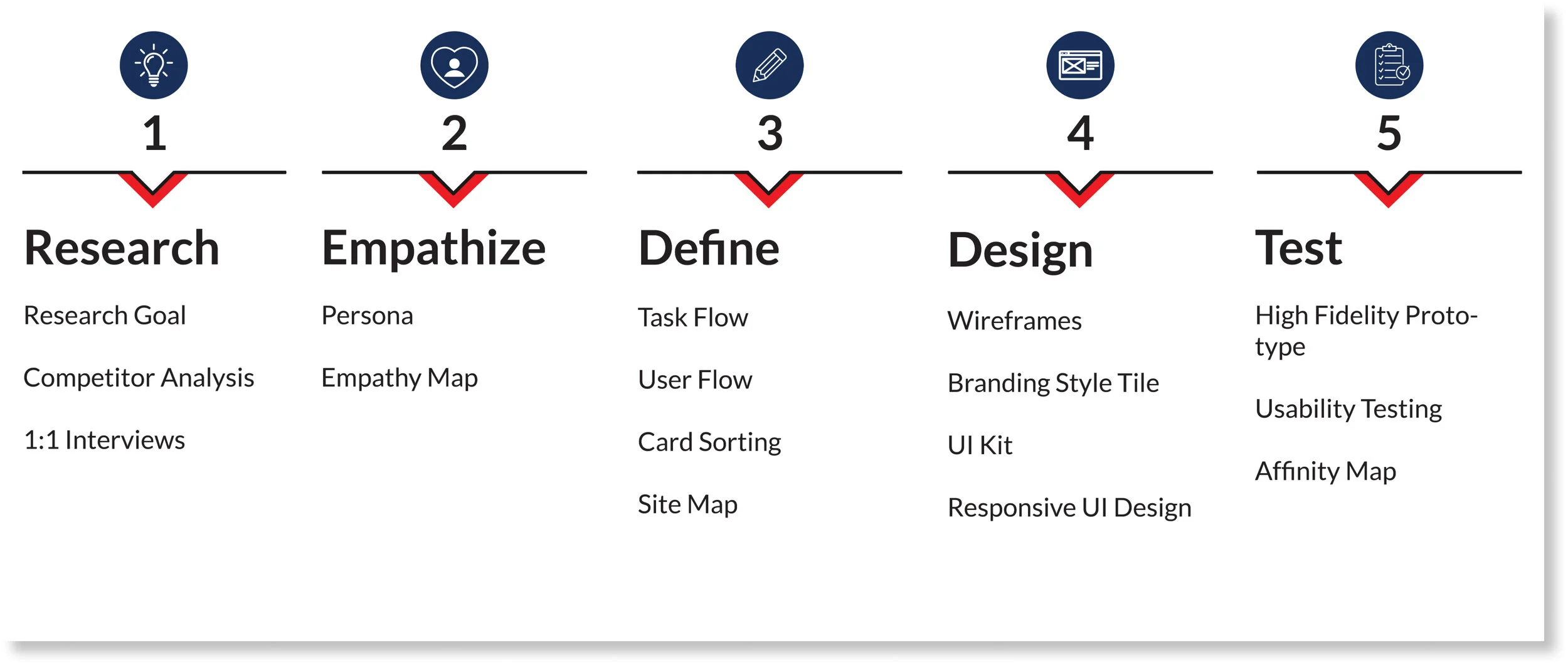
RESEARCH
Research Goals
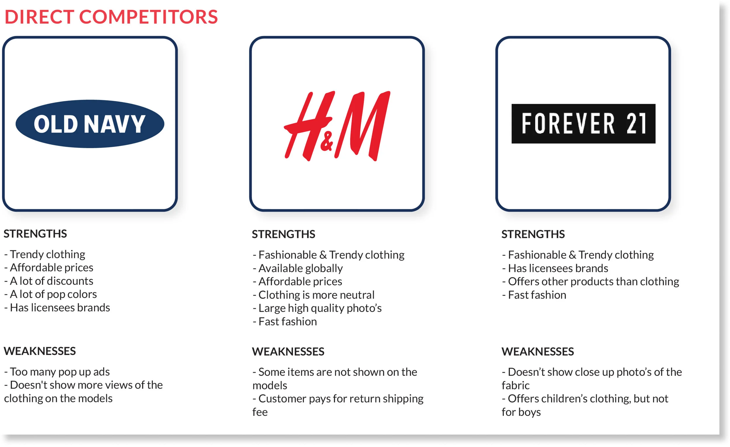
By doing research I learned ways to be different from other competitors, by doing research on 3 direct competitors such as Old Navy, H&M and Forever 21. I also did secondary research on 2 competitors which included Zara and Uniqlo.
What websites have to offer?
What I’ve notice about most e-commerce sites some are similar and offer the following
Pop-ups that have discounts
Shipping or in store pick up
Offers options to pay with installments such as quickpay or afterpay
While viewing a product on the product page websites also show below other items a user may be interested in.
To further my research these are the points I targeted.
Finding out why customers prefer to shop online.
Research what makes it easy to navigate through e-commerce.
Finding out what are customers likes and dislikes about e-commerce.
Finding a solution to make e-commerce an overall good experiencing.
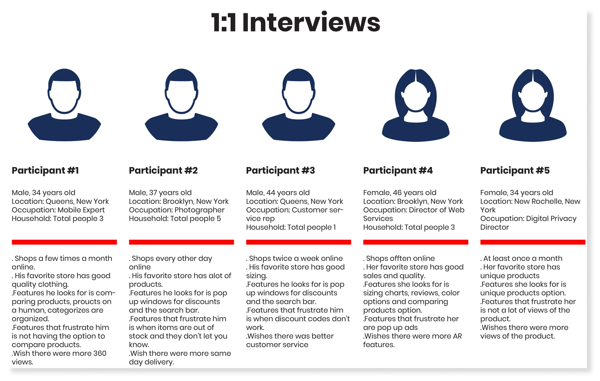
1:1 Interviews
I conducted 1-on-1 interviews with 5 participants that consist of 3 males and 2 females via zoom due to the pandemic. I enjoyed doing 1-on 1 interviews for this project because it was interesting to hear the different responses the participants had and there reasoning behind it.
Research Findings
The majority of the participants use websites instead of an app to shop online.
The reasons why they liked their favorite online stores was because of sales, the layout was easy to navigate, the products were great and being able to find everything in one store.
Negative experiences they encounter mostly had to do with the products such as sizing, quality, or items not looking the same in person as the picture online.
Amazon came up several times about their returning process being easy.
They find that it’s easy to navigate through their favorite stores because of the search bar and everything being categorize well such as t-shirts, accessories, coats, pants etc.
Some of the features they look for while shopping online are photos of the Items with models wearing it so they can see what it looks like on a human body and the search bar.
What frustrated two participants was privacy concerns using their info to target them with more ads and not having a privacy policy.
Three participants mentioned they wish online shopping had more different ways of viewing items better such as 360 views and having AR features especially during the pandemic where we are not able to see a physical item.
EMPATHIZE
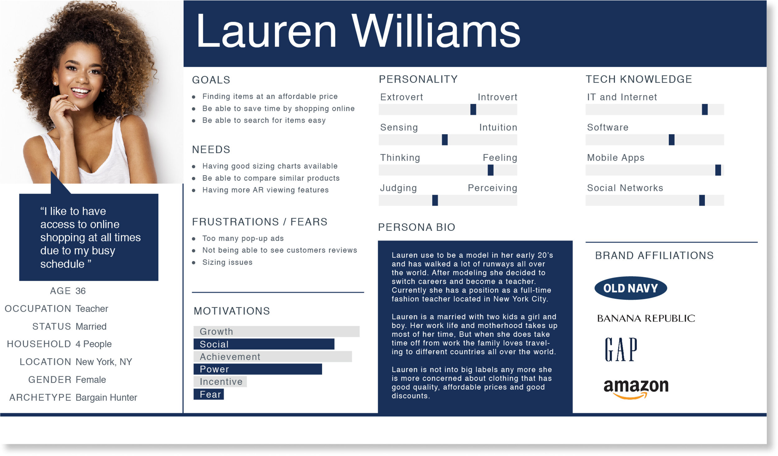
Persona
Based on my research I made a persona of a person named Lauren Williams. The persona allowed me to empathize with the user based on her goals, needs and frustrations while making design decisions.
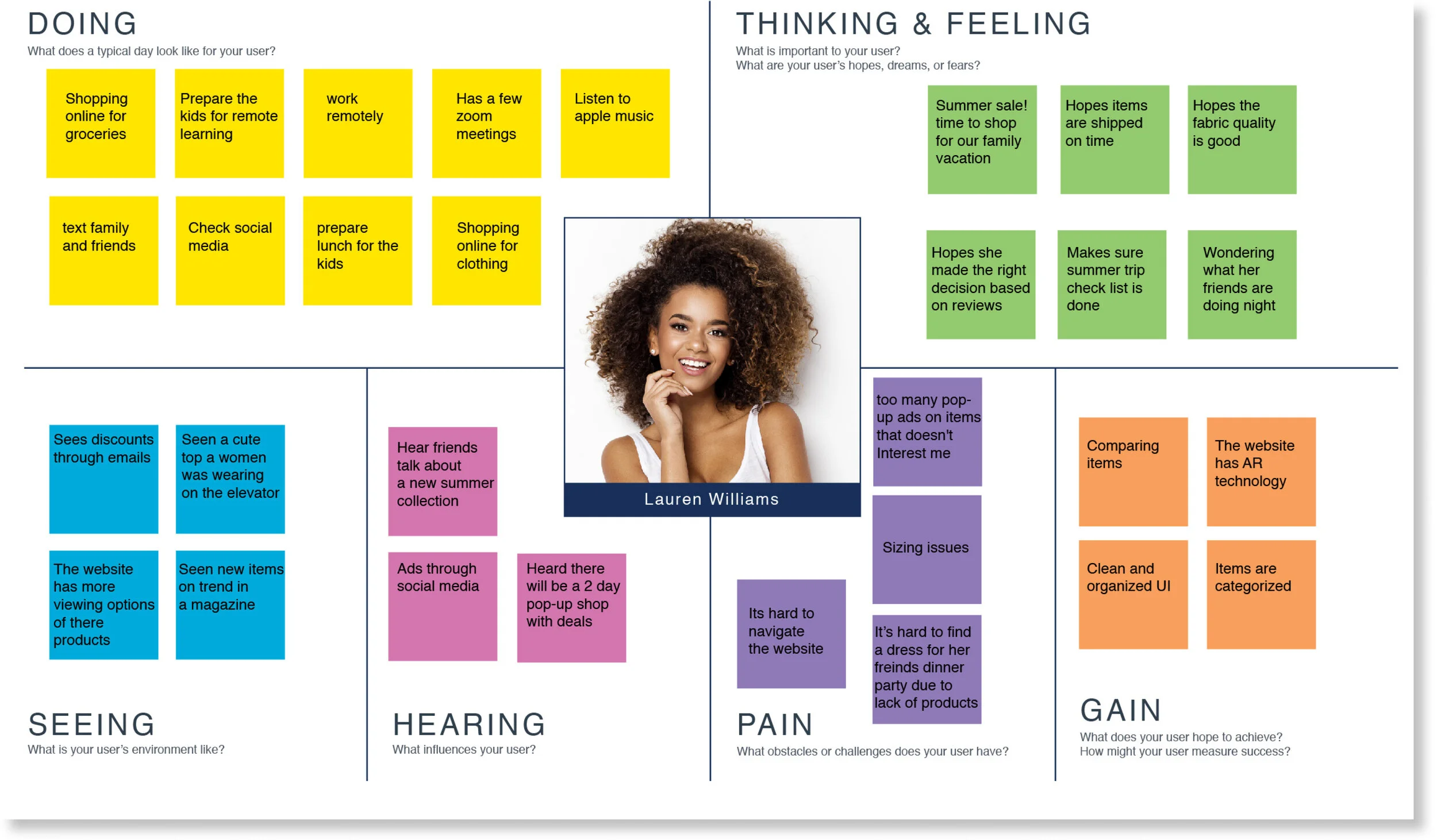
Empathy Map
Next, I created an empathy map to get a better understanding on my persona's needs, thinking, feelings and frustrations so I can apply it to my decision making when it comes to design.
DEFINE
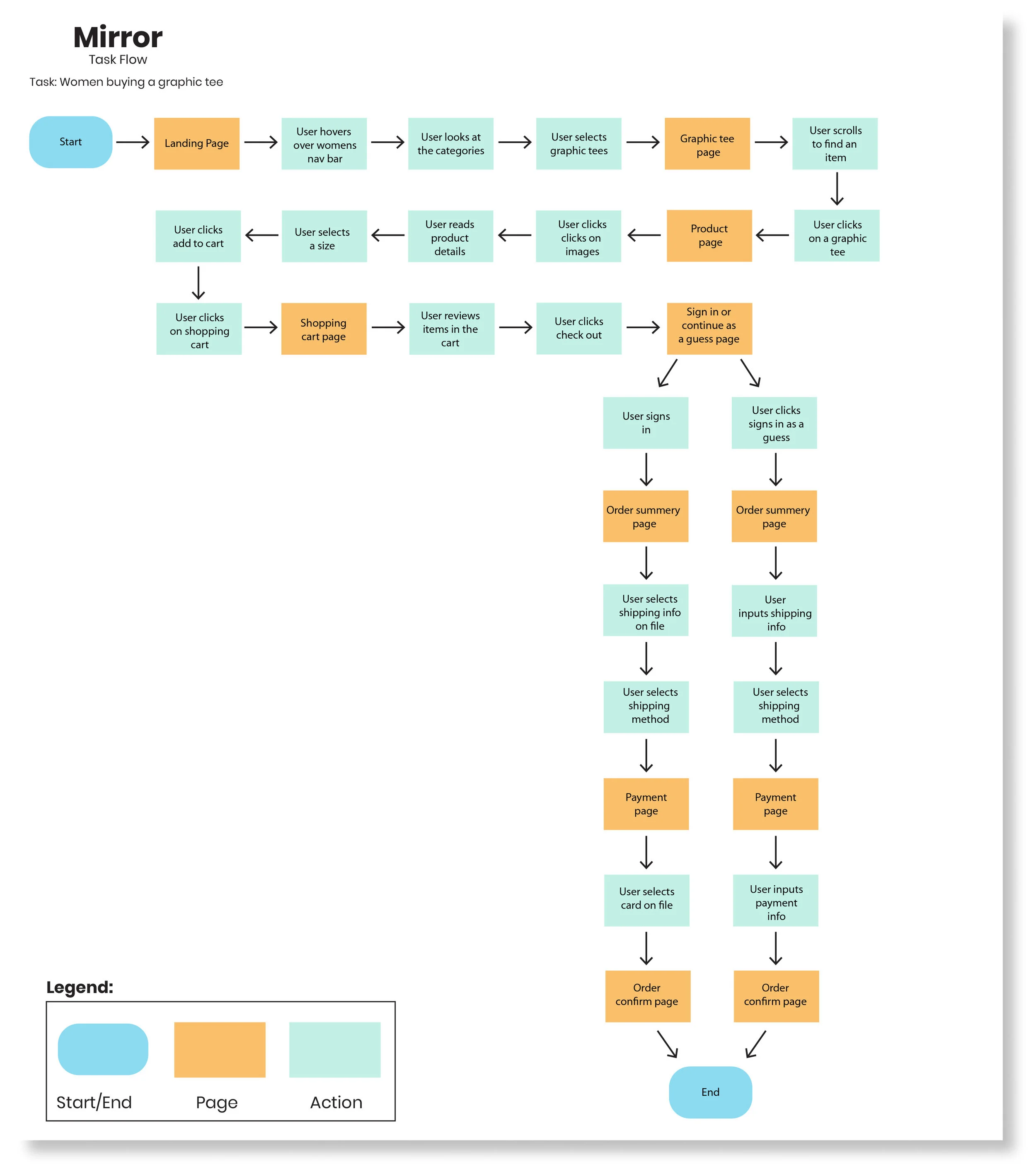
Task Flow
Next, I created a task flow for a user to go on a journey through the website in buying a graphic tee. When the user gets to the check out I take the user through a journey of either signing in or continue as a guess. If a user was to sign in all there information would be stored such as shipping address, billing address and payment information to save time for a faster check out. If the user continued as a guess they would have to fill in all there personal information manually.
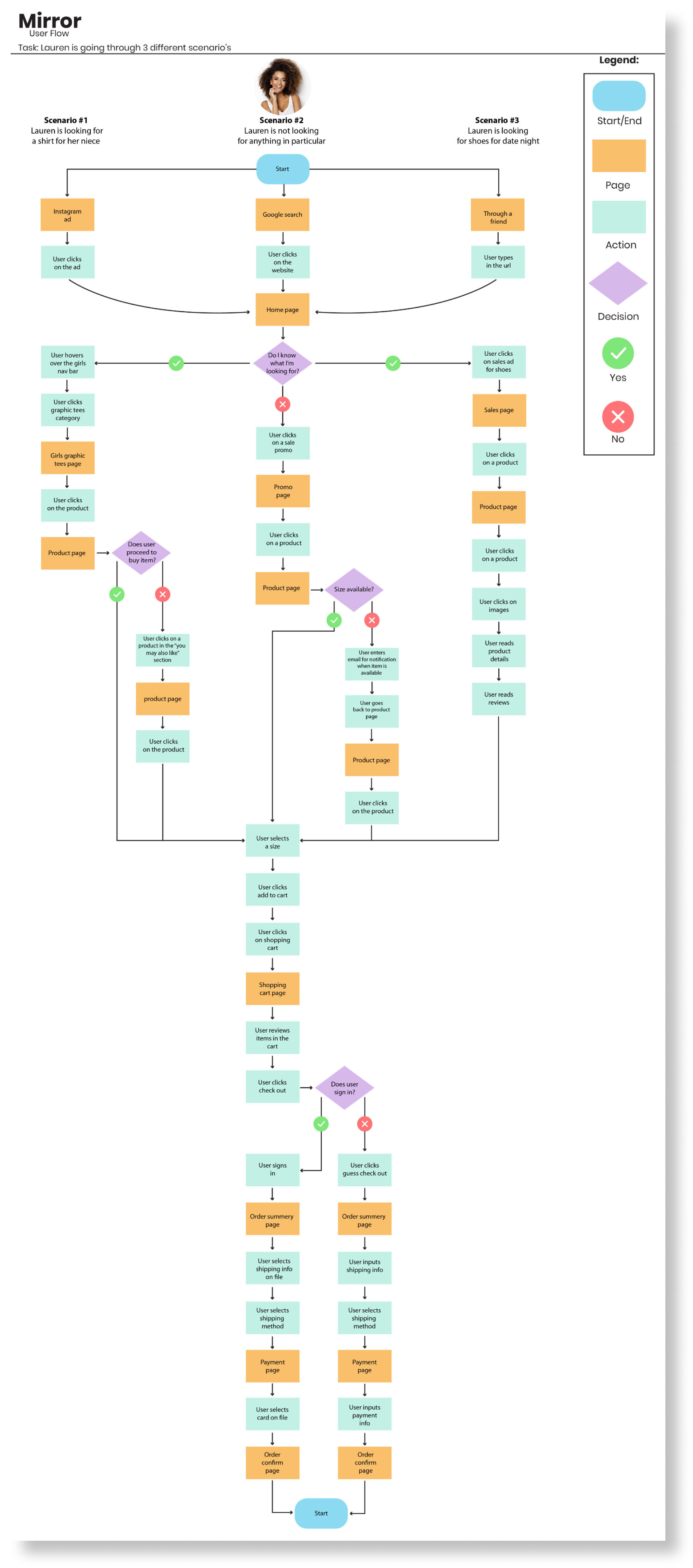
User Flow
A user flow was created for a user to go through 3 different scenario’s through the website. She either started by clicking an Instagram ad, google search or word of mouth through a friend.
Scenario #1 Instagram ad: Lauren is looking for a shirt for her niece.
Scenario #2 Google search: Lauren is not looking for anything in particular and she is just browsing.
Scenario #3 though a friend: Lauren is looking for shoes for a date night.
Creating this user flow really allowed me to see all the steps it takes for Lauren from start to finish. I never really thought about what a user has to go through in detail on how many steps it takes a user such as Lauren. This really allowed me to think about how I should design Mirror's website and acknowledge some of the frustrations a user might have.
CARD SORTING
Overview
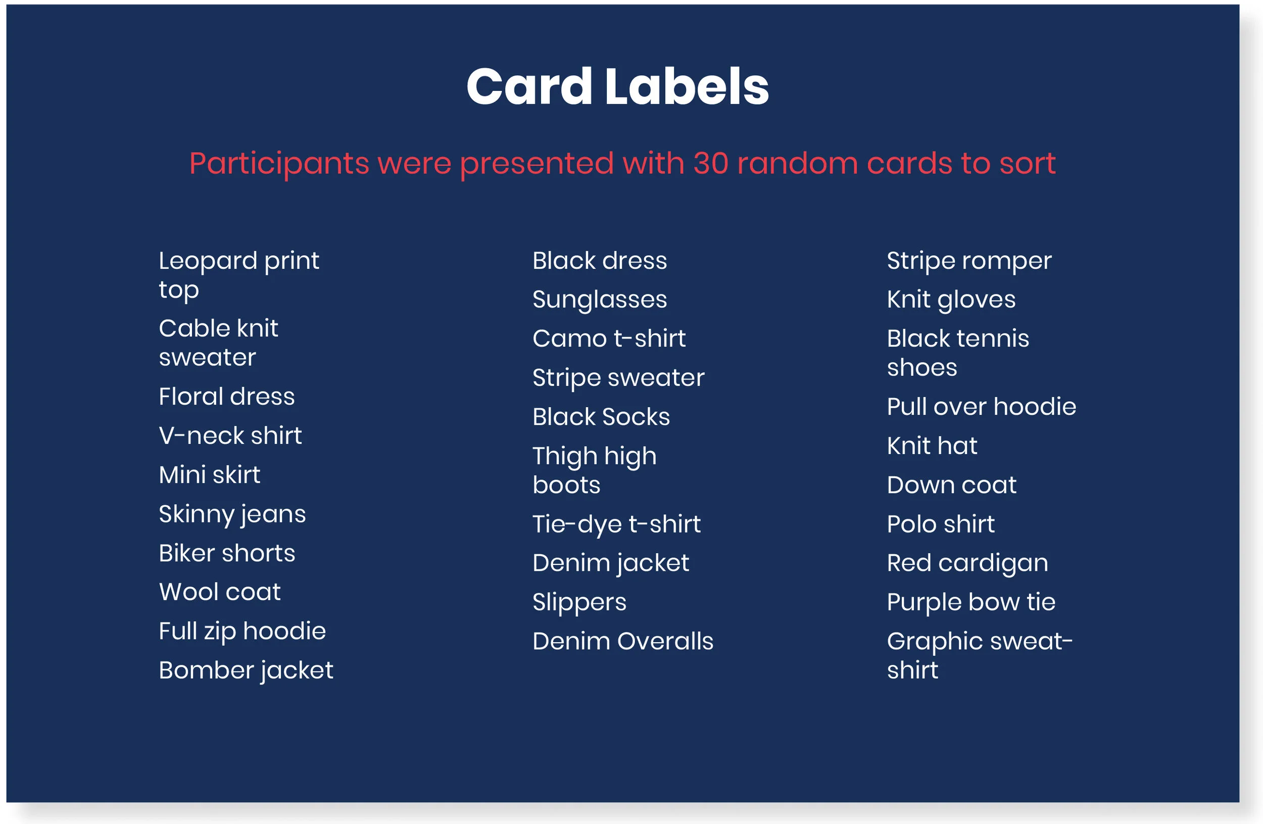
Card sorting is one of my favorite parts in conducting research for this project. It was very interesting to see how other people would put items into categories and their reasoning behind it. I created an open card sort through Optimal Workshop of 30 cards for participants to create and name their own categories.
Participants
I had 8 participants
5 males and 3 females
Age range from 34-43 years old
I originally had 5 participants, but I didn’t have enough data because one person created categories based on occasion or collection, so I contacted 3 more participants to gather more data.
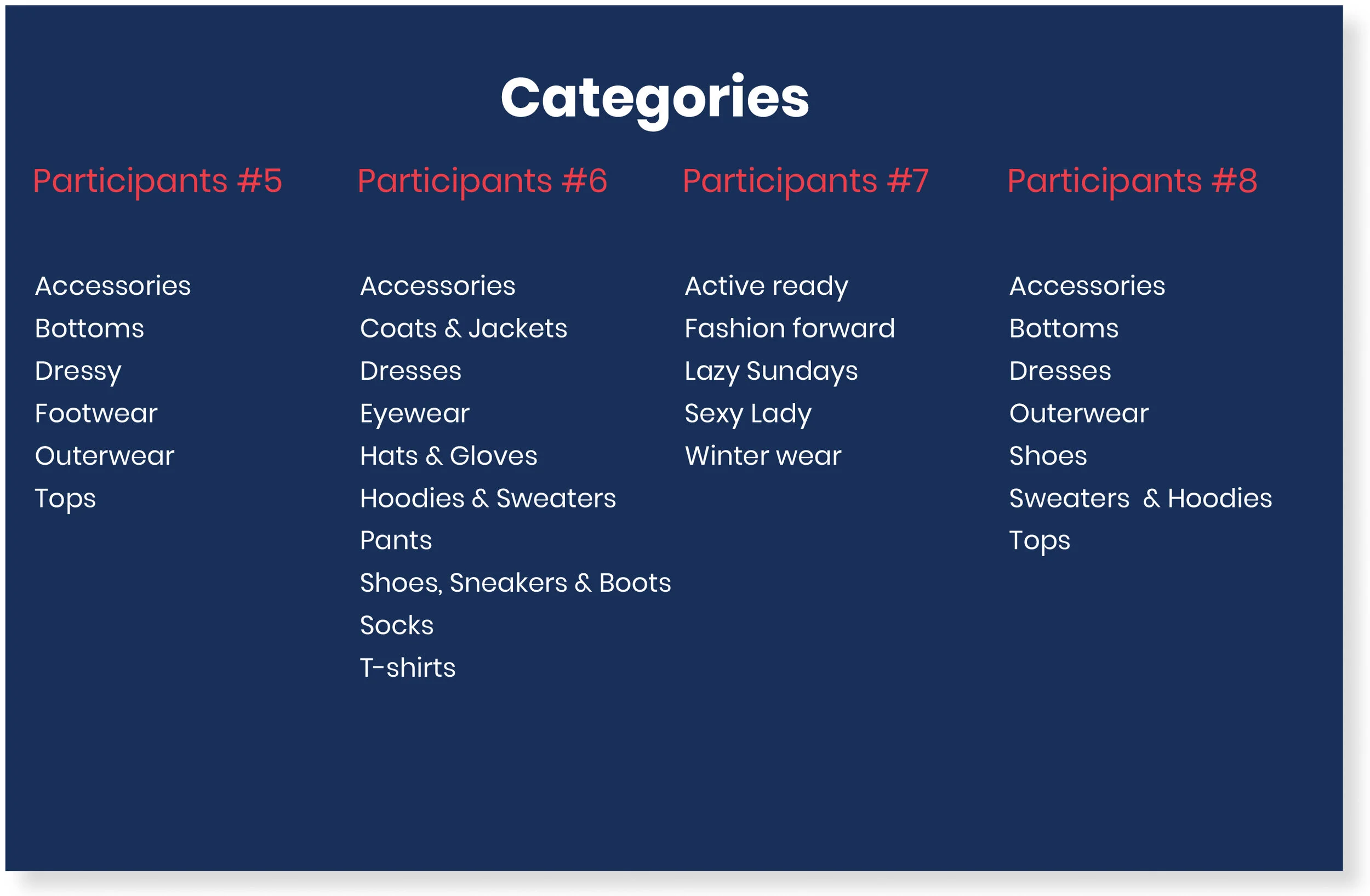
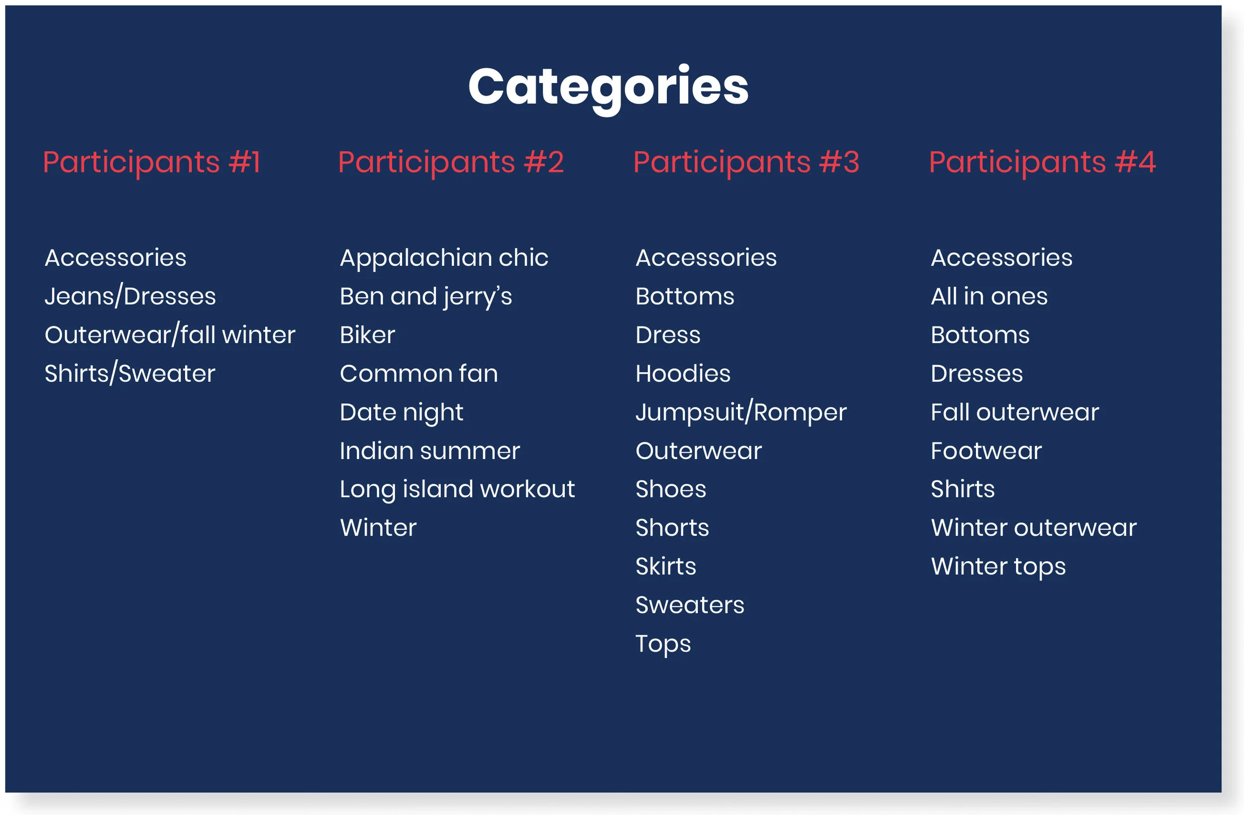
Summery Results
The highest number of categories participants agreed on was 3.
All participants agreed on tops & accessories as a category.
The majority of the participants created the following groups hoodies, sweaters, bottoms, dresses, & shoes.
I notice 2 participants created categories that were a little different than what is standard in other retail websites. They created categories based on an occasion or collection.
The average time it took the participants to do the survey was 10 minutes.
The main categories I decided to proceed with are tops, accessories, hoodies, sweaters, bottoms, dresses and shoes.
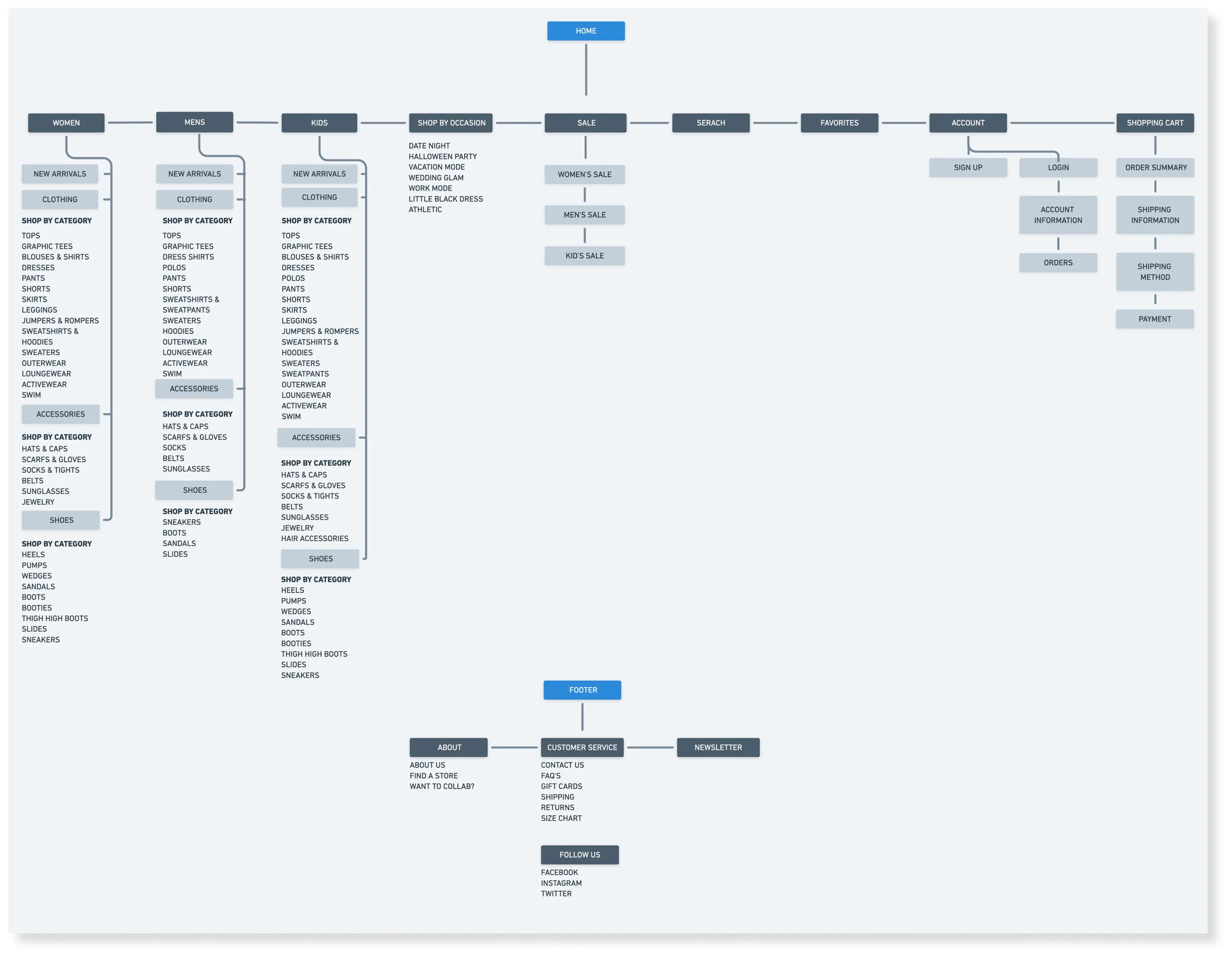
Site Map
Next, I created a site map using Whimsical for Mirrors overall structure of the website based on the open card sort for the home and footer navigation by breaking down the categories and also creating sub-categories. I made sure to included women's, men's and kid's on the main navigation because Mirror is a clothing brand for all types of people.
DESIGN
Branding
Mood Board
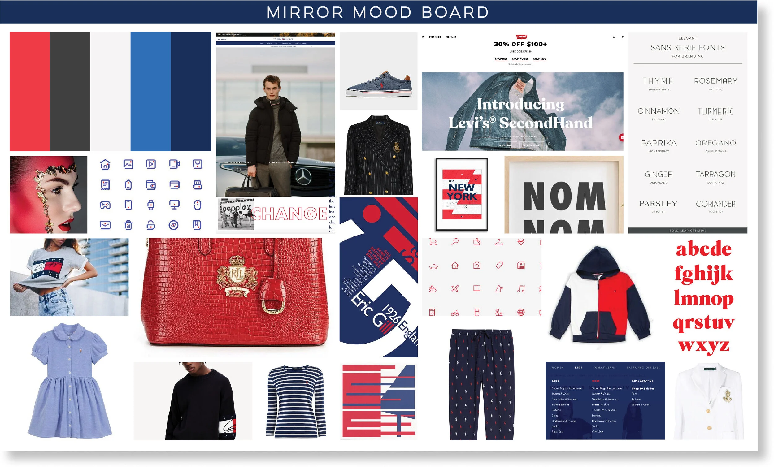
I created a mood board that has an Americana feeling which includes a red, white and blue color palette and I pulled inspiration from brands such as Ralph Lauren, Tommy Hilfiger and Levi’s. I also pulled inspiration from Pinterest with the icons and typography.
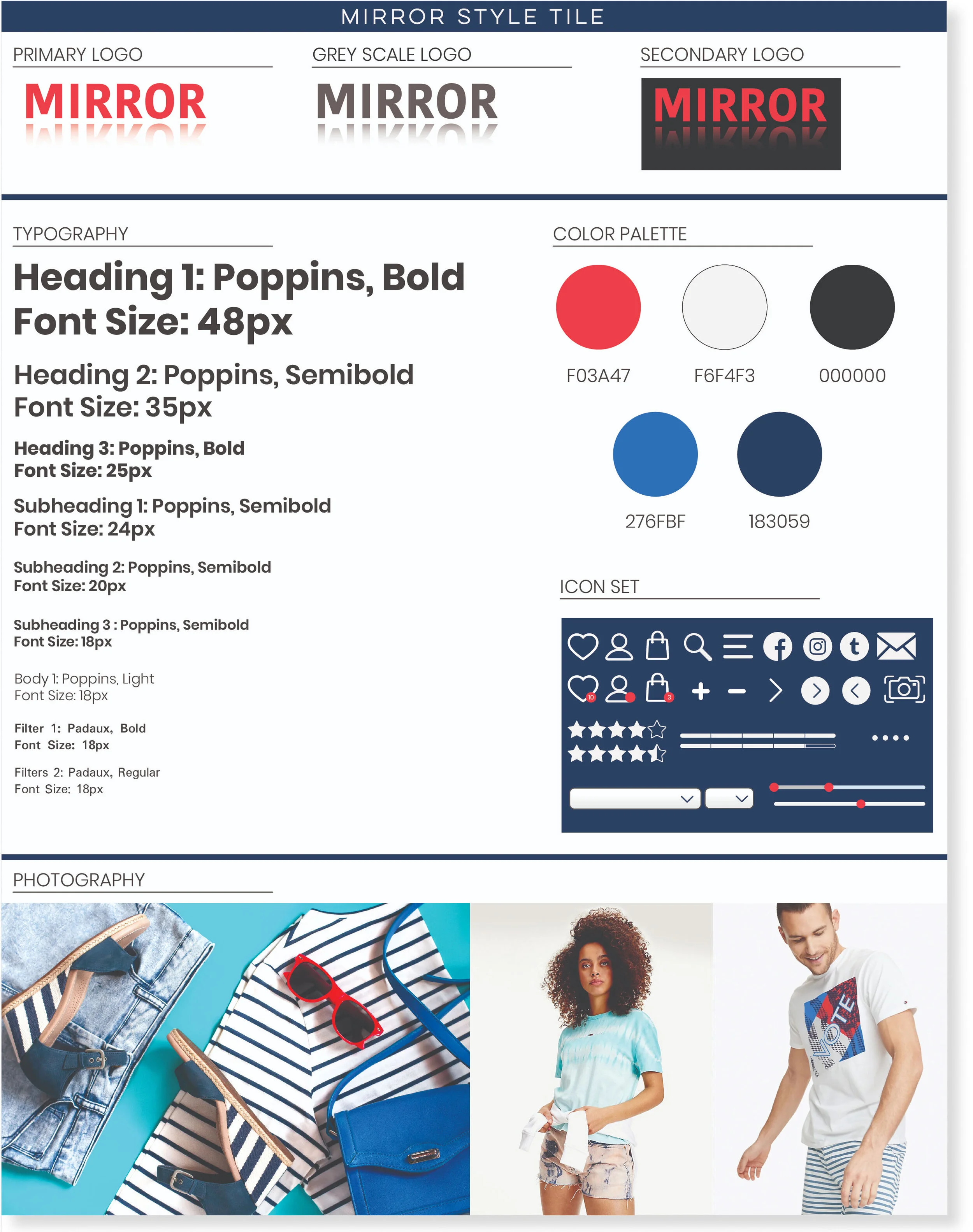
Branding Style Tile
I created a branding style tile which includes the logo, typography, color palette and icon set.
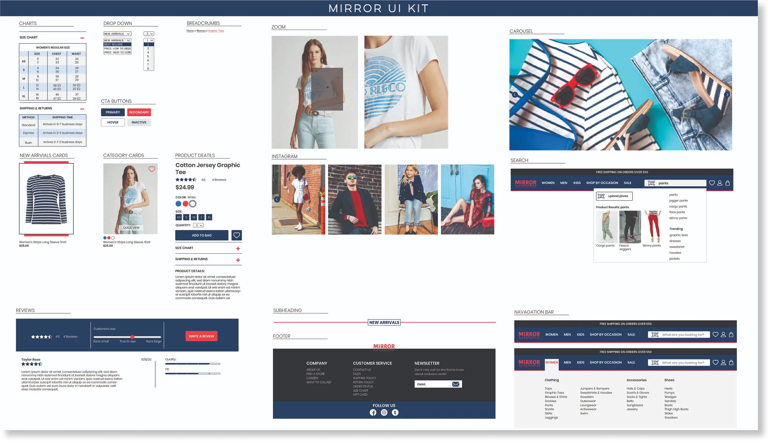
UI Kit
Before moving into high fidelity I created a UI kit which I got inspiration from other retail brands by doing some research. I included all the elements such as charts, navigation, footer, reviews, product details, photography etc.
Low Fidelity & Mid Fidelity Wireframes
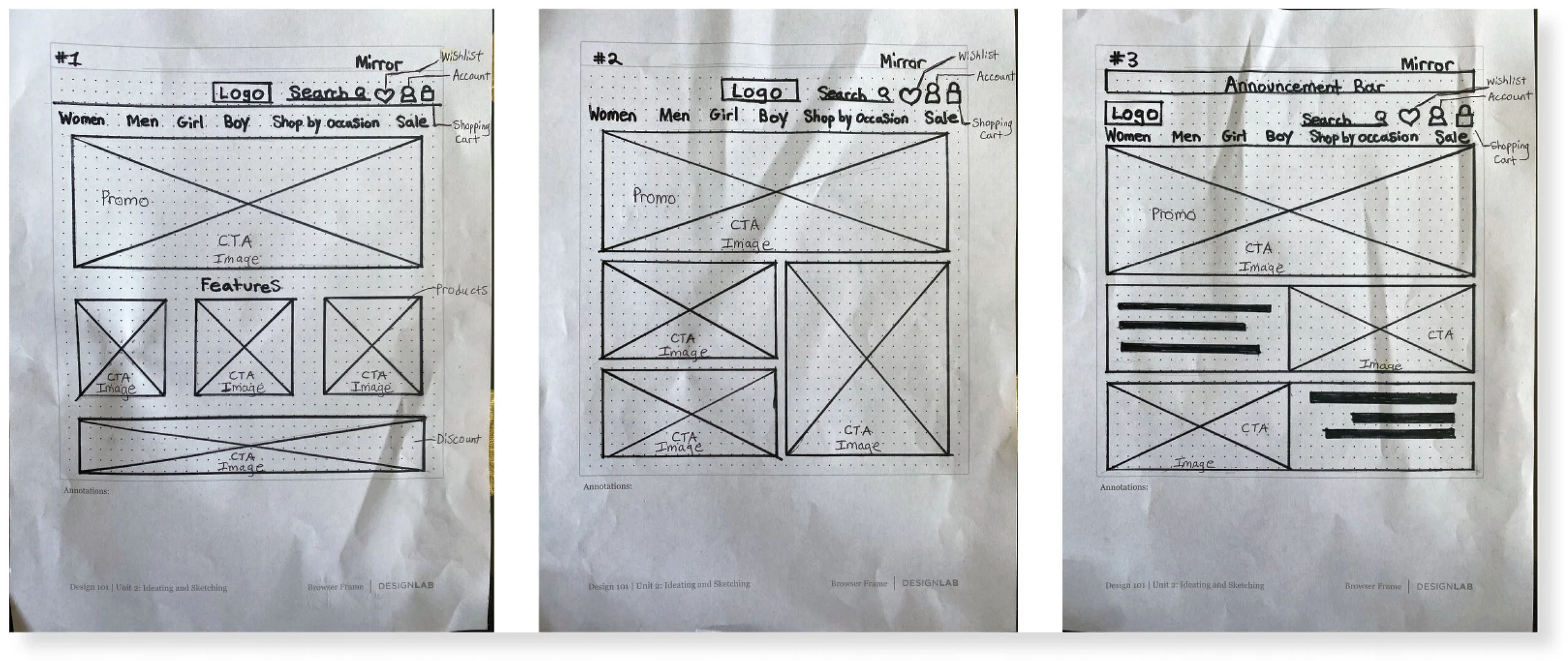
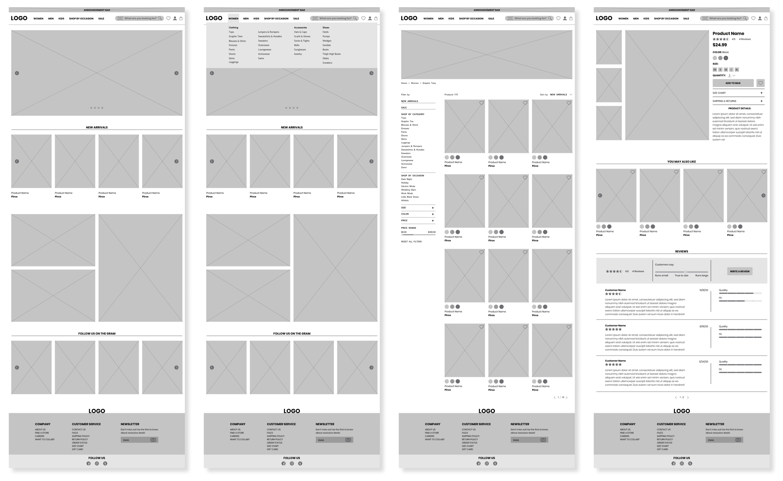
I created 3 versions of Mirror's landing pages in low fidelity wireframe sketches which included the navigation where you can find the search bar, wish list, account and shopping bag icons, along with the main categories. I also included an announcement bar, CTA promo images and CTA product features. I ended up taking some elements from sketch #1 and #3 and combined them in my mid fidelity wire frames that was created in Figma. For the mid fidelity wire frames I created the homepage, homepage with a drop down menu, category page and product page.
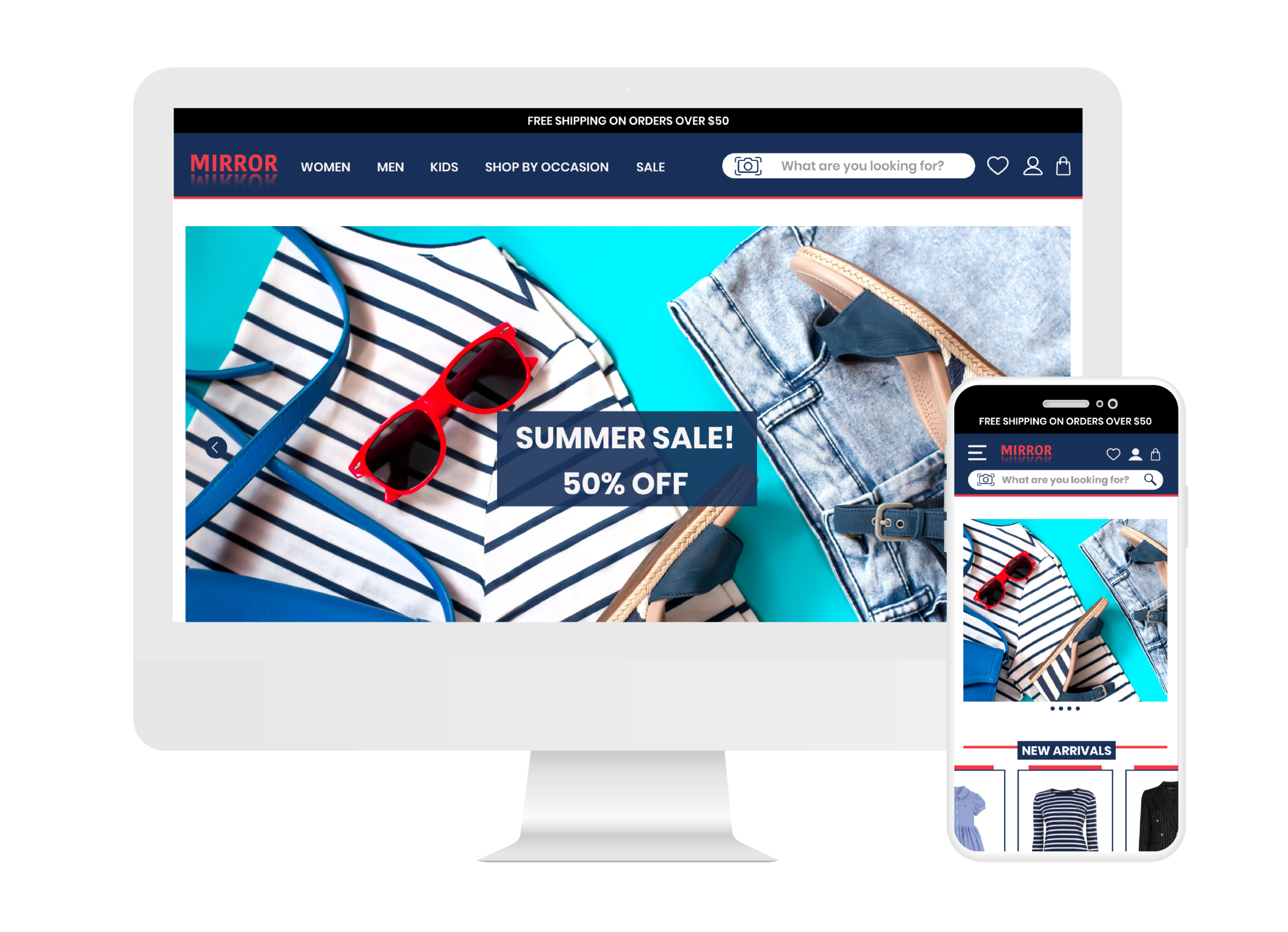
Responsive UI Design
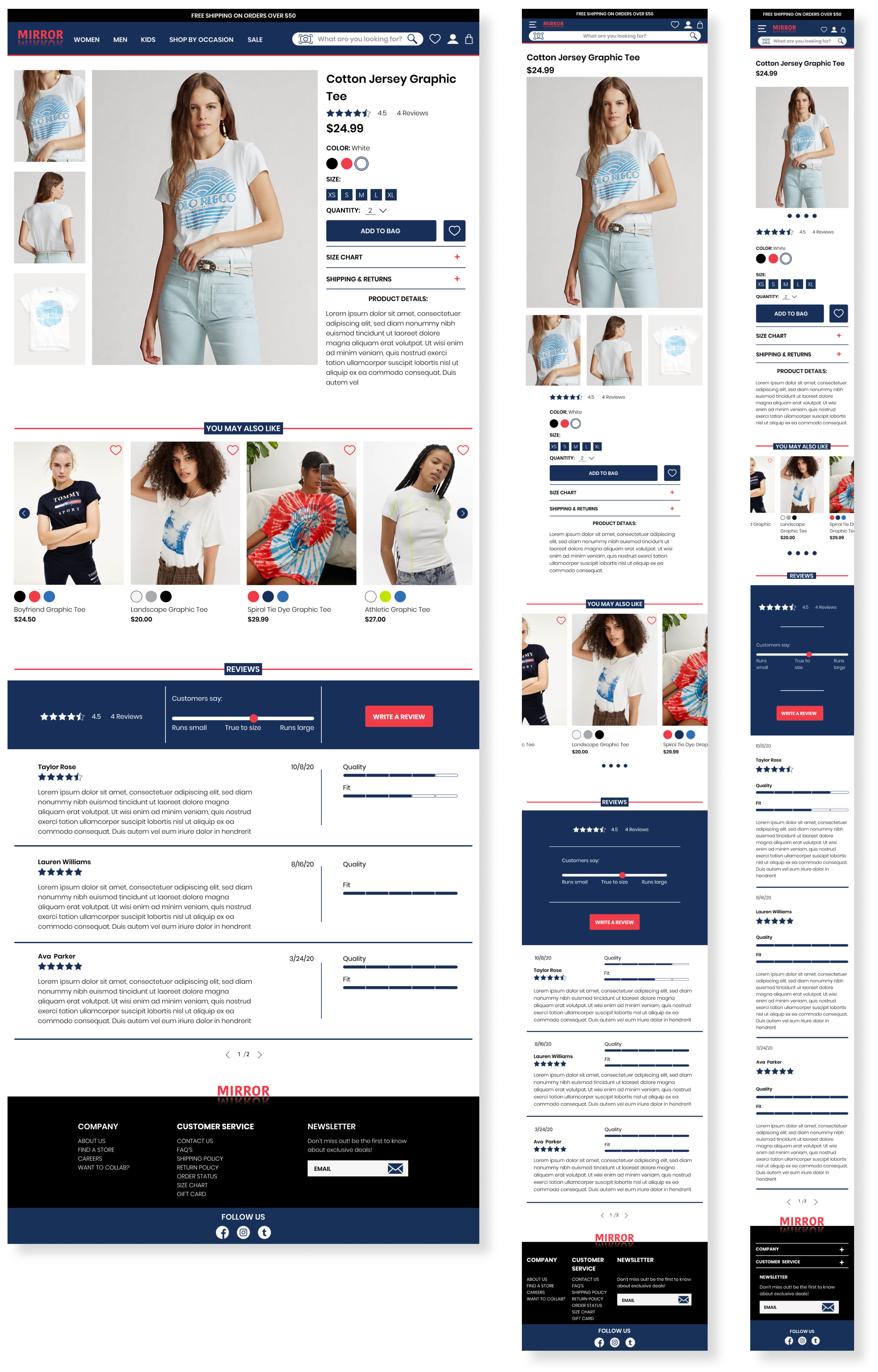
I created a high fidelity responsive design of the product pages for desktop, tablet and mobile. I used product pictures, product details, products that users may also like, customer reviews and the footer. This was a challenge to size down to the mobile version to fit all the elements on a smaller page, but as a product designer I made sure the elements was consistent and remained usable with a clean design for users.
TEST
High Fidelity Prototype
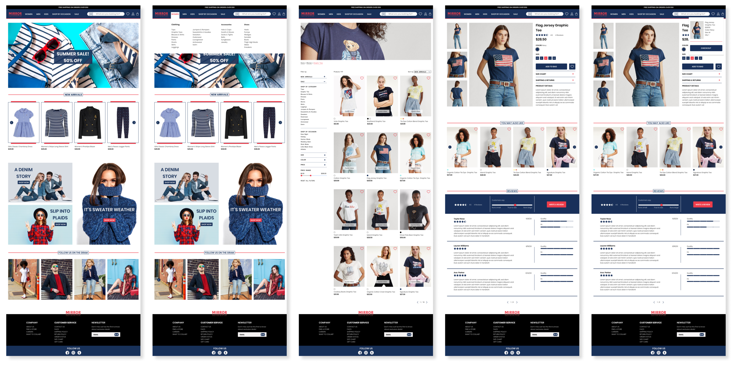
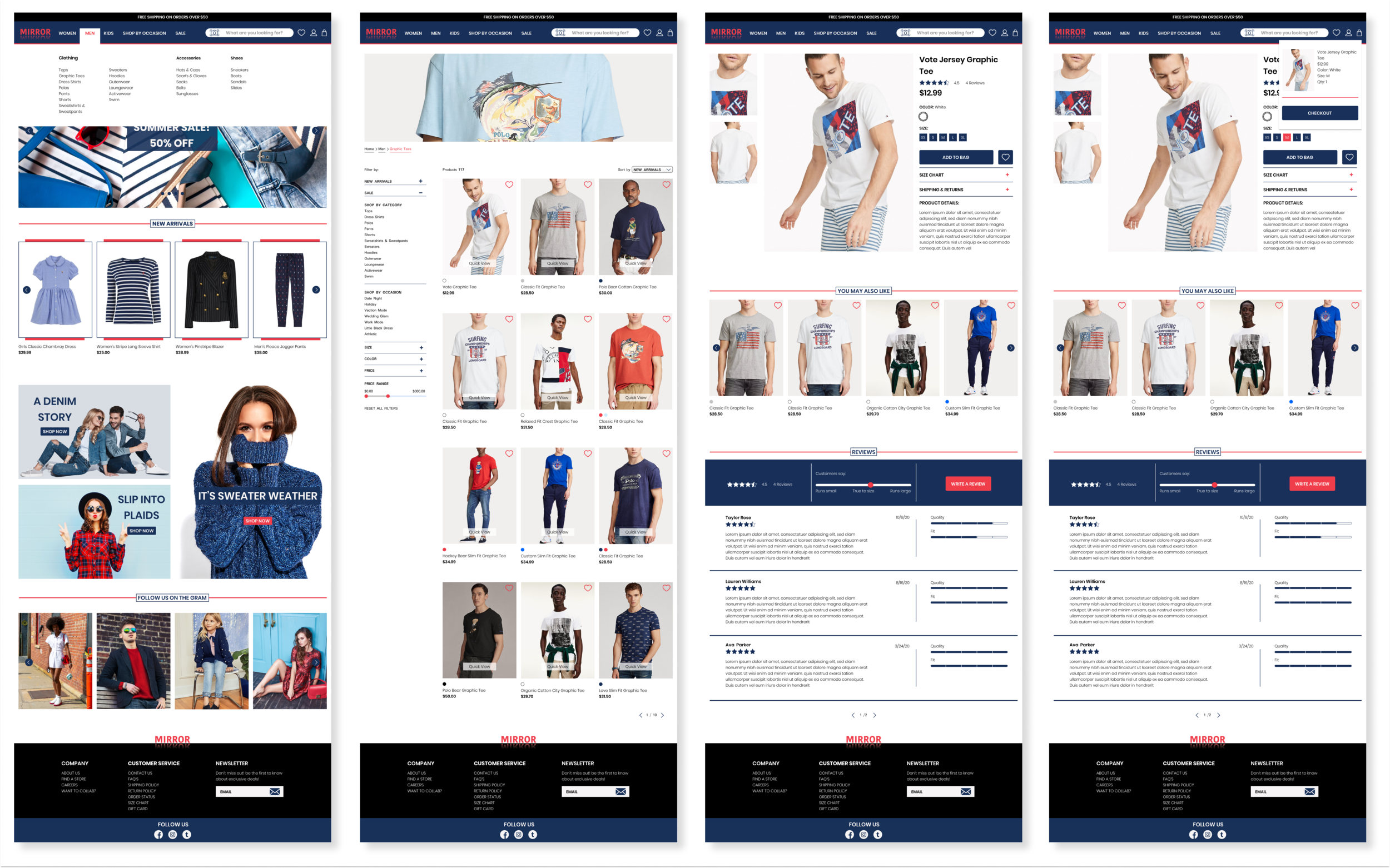
Now it was time to put it all together and I created a high fidelity prototype where a user was able to buy a graphic tee in women’s or men’s categories using Figma.
Usability Test
Testing Goals
Test the overall navigation throughout the site.
Test the overall design flow.
Determine how long a user spends time on each task.
Identify any issues a user may have or any difficulties.
Participants
3 Males, 2 Females
Age range: 33-38
Shops online often
I conducted a usability test of my prototype with 5 people participated remote via google meeting and zoom. 1 person was recorded and notes were taking for the other 4 people. Each participate had 3 tasks to complete which involved buying a graphic tee in women's or men's size M. After the remote interviews I asked each participate additional feedback about the site.
Summary & Feedback
The users thought the UI was clean and easy to navigate.
They didn’t spend too much time completing each task.
I noticed after completing each task and the user moved on to the next task, they would click women’’s or men’s on the navigation bar first. But they were forced to click on the logo. Which is something that I had to fix on my end for further testing.
The majority of the users use the search bar, filters, and the announcement bar.
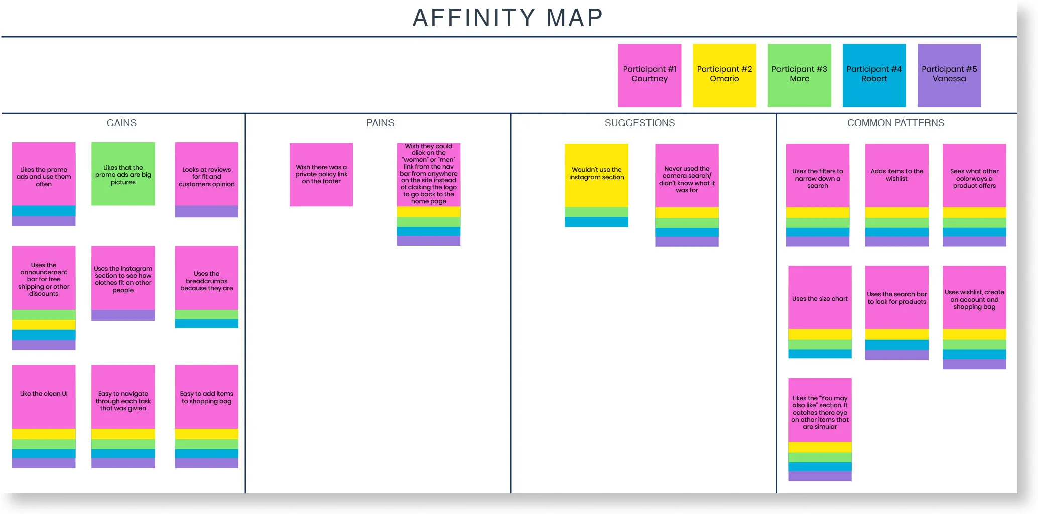
Affinity Map
I created an affinity map based on the 5 participants from my usability test.
The participates thought the UI was clean and easy to navigate.
They didn’t spend too much time completing each task.
The majority of the users use the search bar, filters and the announcement bar.
CONCLUSION
I do a lot of my shopping online and I can imagine a lot of people shopping online especially during the pandemic, So It was very interesting to conduct usability research and 1 on 1 interviews with participants to get an inside of what other people’s frustrations were about online shopping. I didn’t realize there were so much research that needed to go into this project and it taught me a lot about conducting interviews, user flow, testing, empathizing with users and all the elements that go into designing an e-commerce site that may have never crossed my mind before. Some of the challenges I faced was not collecting enough data and keeping in mind that there is no right or wrong answer in some of the research I conducted with participants, but I went back and revised my interview questions and contacted more participants in card sorting, so I would have enough data. Overall, I was able to listen to the user’s needs and frustrations so I can design a high-quality product that is easy and useful for a user to have great shopping experience.